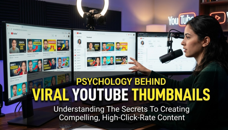
Have you ever scrolled through YouTube and clicked on a video just because the thumbnail looked so good you couldn't help yourself? That's no accident. The psychology behind viral YouTube thumbnails is a carefully crafted science — blending color theory, human emotion, facial expressions, and brain triggers to make your finger tap before your brain can even think. Every top creator knows this. And once you understand it too, you'll never look at a thumbnail the same way again.
YouTube is the second-largest search engine in the world, with over 500 hours of video uploaded every single minute. In that sea of content, your thumbnail is your first handshake with the viewer. It has less than two seconds to make an impression. Two seconds. That's faster than it takes to tie your shoe.
This guide breaks down exactly how the human brain responds to thumbnails — and what separates a video with 300 views from one with 30 million.
Why Your Brain Makes Snap Decisions About Thumbnails
Before we get into design tricks, let's talk about what's actually happening inside your head when you see a thumbnail. The human brain processes visual information 60,000 times faster than text. That's not a typo. In milliseconds, your brain scans an image, assigns emotional meaning to it, and decides whether it's worth your time. This happens in the limbic system — the part of your brain responsible for emotion and gut feelings. Creators who understand this don't design thumbnails for the eye. They design them for the brain.The Role of Pattern Interruption in Thumbnail Psychology
When you're scrolling, your brain goes on autopilot. Everything starts to look the same. Suddenly, a thumbnail breaks the visual pattern — maybe it has a wild color, a shocked face, or unexpected text — and your brain says, "Wait. What is that?" This is called pattern interruption, and it's one of the most powerful psychological tools in thumbnail design. The brain is wired to notice change. Anything that looks different from its surroundings gets attention instantly.Key insight: Thumbnails that stand out visually are not just pretty — they are psychologically engineered to hijack the brain's attention system.
The Emotional Face Effect — Why Faces Dominate Viral Thumbnails
Look at the thumbnails of YouTube's biggest creators. MrBeast. Mark Rober. Emma Chamberlain. What do they almost always have in common? A face. Usually, a very expressive one. This isn't vanity. It's science. Humans are social creatures. We are hardwired to read faces. There's even a specific area in your brain — the fusiform face area — that does nothing but process faces. It fires up the moment you see a human face, even in a tiny thumbnail on a 6-inch screen.Expressions That Drive the Most Clicks
Not all expressions work equally. The most click-worthy emotions tend to be the ones that signal something is at stake. Shock, surprise, fear, disbelief — these faces tell your brain, "Something big is happening here." And your brain wants to know what that thing is.| Facial Expression | Psychological Trigger | CTR Impact |
|---|---|---|
| Shock / Surprise | Creates curiosity — "What happened?" | Very High |
| Excitement / Happiness | Positive association, feel-good emotion | High |
| Fear / Concern | Triggers threat-detection instinct | High |
| Disgust / Disbelief | Strong pattern interrupt | Medium-High |
| Neutral / No face | No emotional trigger | Low |
Color Psychology — How Hues Hack Your Decisions
Color is not decoration. Color is communication. The colors in a thumbnail send signals to your subconscious before you've read a single word.Which Colors Perform Best in Viral YouTube Thumbnails
Research into YouTube CTR (Click-Through Rate) consistently shows that bright, high-contrast thumbnails outperform muted ones. Here's a quick look at how different colors psychologically function:| Color | Psychological Effect | Best Used For |
|---|---|---|
| Red | Urgency, excitement, danger | Drama, challenge, breaking news |
| Yellow | Happiness, energy, optimism | Lifestyle, motivation, kids content |
| Blue | Trust, calm, professionalism | Finance, tech, education |
| Orange | Enthusiasm, creativity, boldness | DIY, food, travel |
| Green | Growth, nature, health | Wellness, fitness, sustainability |
| Black | Power, luxury, mystery | Premium content, cinematic style |
The Contrast Principle in Thumbnail Design
Think of contrast as the volume dial of your thumbnail. The higher the contrast between elements, the louder your thumbnail screams from the feed. Yellow text on a dark background. A bright red arrow on a white space. A neon green object surrounded by gray. These combinations don't just look bold — they force the eye to go exactly where the designer wants.Pro tip: YouTube's interface has a lot of white and gray. Thumbnails with bright, warm colors — especially red, orange, and yellow — naturally stand out more against that neutral backdrop.
The Curiosity Gap — The Most Powerful Trick in Thumbnail Psychology
Here's a question: What happens when someone gives you half of the answer and asks you to find the rest? You can't stop thinking about it. That's the curiosity gap. Coined by psychologist George Loewenstein in the 1990s, the curiosity gap theory says that humans feel a deep mental discomfort when they have incomplete information about something that interests them. The only way to relieve that discomfort is to get the full picture. In YouTube terms, that means clicking the video.How Thumbnails Create the Curiosity Gap
A thumbnail that shows something interesting — but leaves the key detail out — forces your brain into a loop. "What is in that box?" "Why is she crying?" "How did that happen?" These open questions feel uncomfortable. And clicking the video is the fastest way to close that loop.90%
of top-performing videos use a curiosity gap in the thumbnail or title
2x
Higher CTR when thumbnails pair a face with an unresolved question
< 2s
Time a viewer spends deciding whether to click a thumbnail
68%
Of viewers say a thumbnail is the #1 reason they click a video
Text in Thumbnails — Less Is More, Always
Many beginners make the same mistake: they cram their thumbnail with text, hoping to explain the whole video in the thumbnail. This almost always backfires. The best thumbnails use three to five words max, sometimes zero. The text's job is to amplify the image — not replace it. A picture of a car wreck with the word "SURVIVED" tells a more powerful story than a paragraph explaining what happened.Font Psychology and Why It Matters
Even the style of text sends subconscious signals. Bold, chunky fonts feel energetic and powerful. Clean, minimal fonts feel professional and calm. Handwritten fonts feel personal and relatable. The font choice should match the mood of the content.| Font Style | Psychological Feel | Common YouTube Niche |
|---|---|---|
| Bold, blocky | Power, urgency, excitement | Gaming, challenges, sports |
| Clean sans-serif | Trust, clarity, modernity | Tech, finance, education |
| Handwritten | Warmth, authenticity, creativity | Lifestyle, vlogs, art |
| Italic/serif | Drama, storytelling, emotion | Documentaries, history |
Watch out: Avoid using more than two fonts in a single thumbnail. Multiple font styles create visual noise and reduce focus. Pick one dominant font and stick with it.
The Rule of Thirds — Design Psychology That Guides the Eye
Here's one of the most used design principles in all of visual media, and it works just as well on thumbnails as it does on movie posters. The rule of thirds works like this: imagine dividing your thumbnail into a 3×3 grid. The four points where the lines intersect are the spots where the human eye naturally gravitates. Place your most important element — a face, a text word, a key object — on one of those intersections, and the viewer's eye will naturally land there first.Visual Hierarchy in Thumbnail Psychology
Visual hierarchy is the order in which your eyes move across an image. Great thumbnails control this path deliberately. Usually, the flow goes something like this: Face or key image → Bold text → Supporting element This three-step path happens in less than a second. If the thumbnail passes this visual journey smoothly, the brain reaches the end of the path with enough emotional context to decide: "I want to know more." Click.Social Proof and FOMO in Thumbnail Design
Two more deep psychological forces drive clicks: social proof and fear of missing out (FOMO). Social proof is the idea that if lots of people are doing something, it must be worth doing. When a thumbnail shows a huge crowd, a number like "10 Million People Watched This," or even just a view count badge, it signals to new viewers that this content is already popular. The brain interprets that as a vote of quality.How FOMO Turns Viewers Into Clickers
FOMO is even more primitive. It taps into the survival instinct — the fear that everyone else knows something you don't. Thumbnails that use words like "secret," "rare," "nobody talks about," or "before it's gone" trigger this feeling directly. Combined with a strong visual, this emotional punch is almost impossible to ignore. The reason the psychology behind viral YouTube thumbnails works so consistently is that these emotional systems are ancient. They predate the internet by hundreds of thousands of years. Creators are just borrowing evolutionary wiring and pointing it at a video platform.Example: A thumbnail showing five friends with shocked expressions and the words "We tried the world's rarest food" hits curiosity gap, social proof, FOMO, and facial emotion — all at once. That's four psychological triggers in one image.
Branding Consistency — The Long Game of Thumbnail Psychology
Here's something that most beginners miss entirely: the best thumbnails are not just about the individual video. They're about training the viewer's brain over time. When a creator uses the same colors, fonts, layout style, and general mood across all their thumbnails, something powerful happens. Regular viewers start to recognize the creator's thumbnails instantly — before they even read the title. The brain learns the visual signature and associates it with quality, entertainment, or value.Building a Thumbnail Brand Identity
This is why channels like Linus Tech Tips, Vox, or Kurzgesagt have thumbnails that feel immediately familiar. Even without the channel name visible, a regular viewer can identify whose video it is in half a second. That recognition shortens the decision-making process dramatically.| Branding Element | Psychological Benefit |
|---|---|
| Consistent color palette | Instant channel recognition in feed |
| Same font usage | Builds visual familiarity and trust |
| Recurring face/pose | Creates parasocial connection over time |
| Consistent layout style | Reduces cognitive load for returning viewers |
| Matching mood/tone | Aligns viewer expectation with content |
A/B Testing Thumbnails — Let the Psychology Prove Itself
Knowing the psychology is powerful. Testing it is even more powerful. YouTube allows creators to A/B test thumbnails through features like YouTube Studio's "Test & Compare." This means you can create two different thumbnails for the same video, show them to different viewers, and see which one gets more clicks. The results are often surprising — and always educational.What to Test in Your Thumbnail Experiments
When testing thumbnails, don't change everything at once. Isolate one variable at a time. Here's a simple testing framework:| Test Variable | What You Learn |
|---|---|
| Face vs. no face | Whether emotion drives more CTR in your niche |
| Text vs. no text | Whether your audience needs a verbal hook |
| Color scheme A vs. B | Which emotional tone resonates better |
| Close-up vs. wide shot | How composition affects visual impact |
| Simple vs. busy layout | How much visual information your viewers prefer |
Common Thumbnail Mistakes That Kill Your CTR
Understanding what works is only half the battle. Knowing what to avoid is just as important when mastering the psychology behind viral YouTube thumbnails.| Mistake | Why It Hurts | Fix |
|---|---|---|
| Clickbait without delivery | Destroys trust, tanks watch time | Match thumbnail promise to content |
| Too much text | Creates clutter, hard to read at small size | Keep to 3–5 words max |
| Low contrast colors | Blends into the feed, gets ignored | Use high-contrast color pairings |
| No focal point | Viewer's eye wanders, no clear hook | Define one hero element |
| Dark or blurry images | Signals low quality to the brain | Use bright, sharp, high-res images |
| Inconsistent style | No brand recognition, harder to build audience | Build a consistent template system |
FAQs About Viral YouTube Thumbnail Psychology
1. Does every successful YouTube video need a face in the thumbnail?
No, but faces significantly increase CTR in most niches. Channels focused on nature, animation, or branded content can succeed without faces — but they need an equally strong emotional or visual hook to compensate. The key is triggering an emotional response, and faces are the easiest way to do that.
2. What thumbnail size does YouTube recommend?
YouTube recommends a thumbnail size of 1280 × 720 pixels with a 16:9 aspect ratio. The file should be under 2MB, saved as JPG, PNG, GIF, or BMP. Designing at this resolution ensures your thumbnail looks sharp on both desktop and mobile screens.
3. How many times should I change my thumbnail if a video isn't performing well?
You can change your thumbnail at any time, and it often helps. Many creators update thumbnails on underperforming videos and see an immediate improvement in CTR. Try testing one new version and give it at least 48–72 hours of data before deciding if it's working.
4. Is clickbait always bad?
Clickbait in the traditional sense — thumbnails that mislead viewers about the video content — is harmful because it tanks watch time and trains YouTube's algorithm to show your video less. However, creating emotionally compelling, curiosity-driven thumbnails that accurately represent the content is not clickbait. It's smart marketing backed by psychology.
5. How does thumbnail psychology differ across niches?
The core psychological triggers — curiosity, emotion, contrast, faces — work across all niches. However, the execution differs. Gaming channels lean on bold, saturated thumbnails with intense expressions. Educational channels use clean, trust-building designs. The best approach is to study what works within your specific niche and reverse-engineer the psychology at play.
6. Can small YouTubers compete with big channels if they master thumbnail psychology?
Absolutely. Thumbnail psychology levels the playing field. A small creator with a psychologically optimized thumbnail can outperform a large channel with a lazy one. YouTube's algorithm rewards CTR and watch time — not subscriber count. A great thumbnail is the fastest way to compete, regardless of your channel size.
7. What is the most important psychological element in a thumbnail?
If you had to pick just one, it would be emotional resonance. A thumbnail that makes you feel something — curiosity, excitement, shock, or FOMO — is infinitely more powerful than a technically perfect but emotionally flat image. Design for feeling first, and let the technical elements support that emotional goal.
