The best colors for YouTube thumbnails can be the difference between a video that gets thousands of clicks and one that gets completely ignored. Before anyone watches a single second of your content, they make a split-second decision — should I click this or scroll past it?
That decision happens in less than two seconds. And your thumbnail's color is doing most of the heavy lifting.
Think about it. YouTube is a wall of competing videos. Every single one is fighting for attention. Your thumbnail needs to punch through that wall before your title even gets read. Color is your first weapon.
In this guide, you'll learn which colors perform best on YouTube, why certain color combinations dominate, and how to apply these principles to your own thumbnails — even if you have zero design experience.
How the Human Eye Reads Color Before Anything Else
Your brain processes color 60,000 times faster than it processes text. That's not a made-up number — that's basic neuroscience. When a viewer's feed loads up, their eyes aren't scanning titles. They're reacting to color, contrast, and brightness.
This is why creators who understand color psychology consistently outperform those who don't — even when the content quality is similar.
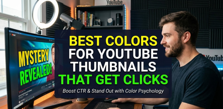
Here's a simple way to think about it. Imagine two thumbnails side by side. One has a washed-out blue background with white text. The other has a bright red background with bold yellow text. Even without reading either title, your eye is already drawn to the second one.
That's color doing its job.
The Science of Contrast and Visual Pop
The most clickable thumbnails almost always have one thing in common: high contrast. Contrast means the colors in your thumbnail are clearly different from each other and from the background behind the content being shown.
High contrast = the eye can instantly identify what's in the thumbnail.
Low contrast = the eye skips right past it.
YouTube's interface is mostly white and gray. That means thumbnails with dark backgrounds or very bright colors naturally stand out more. Your thumbnail is competing not just with other videos, but with the interface itself.
Red — The Highest-Performing Color on YouTube
Red is the single most attention-grabbing color on YouTube. It triggers urgency, excitement, and emotion. It's no coincidence that YouTube's own brand color is red. The platform knows what works.
Red thumbnails work especially well for:
- News and current events
- Reaction videos
- Challenge videos
- Countdown lists
- Finance and investment content
The key with red is to use it boldly. A muted, dusty red won't cut it. You want a bright, saturated red that pops off the screen. Pair it with white or yellow text, and you've got one of the strongest thumbnail combinations possible.
Pro tip: Red text on a dark background also performs extremely well — especially for horror, thriller, or mystery-style content.
Yellow — The Second Most Eye-Catching Choice
Yellow is the color the human eye spots fastest in a bright environment. It screams energy, positivity, and excitement. Many of the biggest YouTubers — including MrBeast — lean heavily on yellow as their signature thumbnail color.
Yellow works best when:
- Paired with a dark background (black, navy, or dark gray)
- Used as a text highlight color rather than a full background
- Combined with red or orange for a high-energy look
Avoid light yellow on a white background. The contrast disappears and your thumbnail becomes invisible.
Orange — The Sweet Spot Between Red and Yellow
Orange combines the urgency of red with the brightness of yellow. It's energetic without being as aggressive as red. Orange thumbnails feel exciting but also friendly — which makes them great for a wide range of niches.
Orange is particularly effective for:
- Food and cooking content
- Fitness and sports
- Motivational and self-improvement videos
- Entrepreneurship and business content
Green — Natural, Fresh, and Surprisingly Powerful
Green is underused on YouTube, which actually makes it a smart choice in certain cases. When most creators are using red, orange, and yellow, a vibrant green thumbnail can stand out through contrast alone.
Bright, neon greens are especially effective. Dark, earthy greens tend to blend into the background and get lost.
Green works best for:
- Nature and outdoor content
- Health, wellness, and nutrition
- Gaming (especially survival/strategy games)
- Finance content (money associations)
Blue — The Trust Color That Needs a Boost
Blue is commonly associated with trust, calmness, and professionalism. However, it's also close to YouTube's recommended video suggestions interface color, which means blue thumbnails can sometimes blend in rather than stand out.
That doesn't mean blue is bad. It means you need to use it strategically.
Blue works well for:
- Technology and science content
- Educational channels
- Corporate and business videos
- Motivation and mindset content
The fix for blue is simple: combine it with a high-contrast color like orange or yellow. Blue and orange are opposites on the color wheel, so they create a naturally eye-catching combination.
Purple — The Niche Dominator
Purple is rare on YouTube, which is exactly why it can be powerful. It signals creativity, mystery, and uniqueness. Channels in the beauty, gaming, spirituality, and entertainment space use purple very effectively.
Because fewer creators use purple, a well-designed purple thumbnail can cut through the clutter in a way that more common colors sometimes can't.
Color Combination Strategies That Dominate Click-Through Rates
V
Why Opposite Colors Always Win
On the color wheel, colors that sit directly across from each other are called complementary colors. When you put complementary colors next to each other, they make each other look more vivid and bright.
The best complementary pairs for YouTube thumbnails are:
- Red + Green (holiday content)
- Blue + Orange (science, sport, travel)
- Purple + Yellow (entertainment, gaming)
- Red + Cyan (tech, gaming)
These combinations don't just look good — they're scientifically wired to catch the human eye faster.
When to Use a Monochromatic Approach
A monochromatic design uses different shades of the same color. This can work on YouTube, but only when done intentionally. Dark channels — like true crime, horror, or cinematic content — often use deep, dark blues or greens to create atmosphere.
The risk with monochromatic designs is low contrast, which means lower click-through rates. To counter this, make sure your text color breaks sharply from your background.
Colors to Avoid on YouTube Thumbnails
Just as important as choosing the right colors is knowing which colors to stay away from.
Light gray and pastel colors are some of the worst performers on YouTube. They get lost in the interface. They read as bland and unexciting.
Muddy browns and beiges have similar problems. They don't command attention and often look unpolished.
Too many colors at once is another trap. Using five or six different colors in one thumbnail creates visual chaos. The viewer doesn't know where to look. You want one or two dominant colors maximum, with a third accent color at most.
Colors that match YouTube's interface — specifically the gray-white background — cause your thumbnail to visually merge with the platform. Always check how your thumbnail looks when placed on YouTube's actual interface.
How to Match Colors to Your YouTube Niche
The best color for your thumbnail also depends on what your channel is about. Here's a breakdown by niche:
V
V
Staying Consistent With Your Channel's Color Identity
One underrated aspect of thumbnail color strategy is consistency. The biggest YouTube channels don't just pick good colors — they pick their colors and stick with them.
When viewers scroll through search results or their subscription feed, they recognize your thumbnails before they even read your name. That recognition is built through consistent color usage over time.
Pick one or two signature colors for your channel. Use them across every thumbnail. Over time, your content becomes instantly recognizable in the feed — and that recognition leads to more clicks from your existing audience.
The Role of Text Color in Thumbnail Design
Your background color is only half the equation. The text on your thumbnail needs to be readable at a small size — because most people see thumbnails on mobile devices, where thumbnails can be displayed at less than 200 pixels wide.
Here are the ground rules for text color in YouTube thumbnails:
White text works on dark or saturated backgrounds. It's clean, bold, and legible. When you need maximum readability, white text is your safest choice.
Yellow text is a classic YouTube pairing with red or dark backgrounds. It pops loudly and feels energetic.
Black text works on bright backgrounds like yellow or white. Avoid black text on dark backgrounds — it disappears instantly.
Red text should be used sparingly but can work well on black or very dark backgrounds for a high-impact look.
Text Outline and Drop Shadow Rules
If you're placing text on a complex background (like a photograph), add a simple outline or drop shadow to your text. This ensures it stays readable regardless of what's behind it.
A white outline on dark text or a black outline on bright text creates the separation needed for legibility. Keep shadows subtle — 2 to 3 pixels is usually enough.
What Top YouTubers Are Doing With Color (And What You Can Copy)
Studying successful creators is one of the fastest ways to improve your thumbnail game. Here's what consistently top-performing channels do with color:
MrBeast is famous for bright yellow, combined with exaggerated facial expressions and bold white or red text. The yellow is his signature. You'd recognize a MrBeast thumbnail from across the room.
PewDiePie often uses high-contrast combinations — dark backgrounds with vivid neon text or bright face close-ups. His thumbnails feel immediate and dramatic.
Mark Rober leans on blue, white, and orange — a combination that signals science, intelligence, and excitement all at once. It works incredibly well for educational content.
Veritasium uses dark, cinematic palettes — deep blues and blacks — with bright, contrasting text. This creates a sense of mystery and seriousness that fits his content style.
The lesson? The best creators build a visual language around their content. Color is the foundation of that language.
Practical Tips for Applying Thumbnail Colors That Get More Clicks
Knowing which colors work is step one. Actually applying them effectively is step two. Here's how to put it all together.
Keep Your Color Count Low
Use a maximum of three colors per thumbnail — one main background, one accent, and one text color. Any more than that and the design becomes chaotic. Simplicity is what creates clarity, and clarity drives clicks.
Test Your Thumbnails Before Publishing
Before you upload, check your thumbnail against a fake YouTube feed. Shrink it down to 130x73 pixels and see how it looks. Does it still stand out? Is the text readable? Does the color pop?
You can also use tools like TubeBuddy to A/B test different thumbnail designs and find out which colors get more clicks for your specific audience.
Use Canva or Other Design Tools
You don't need expensive software to make great thumbnails. Tools like Canva make it easy to experiment with color combinations, try different text styles, and build thumbnails that look professional — even if you have no design background.
These platforms also let you save your brand colors so that every thumbnail stays consistent.
Check Your Thumbnail on Mobile
More than 70% of YouTube views happen on mobile devices. Always check your finished thumbnail on a phone screen before publishing. Colors that look vibrant on a desktop monitor can sometimes look duller on certain phone screens.
Common Thumbnail Color Mistakes That Kill Click-Through Rates
Even creators who understand color theory can fall into common traps. Here are the biggest mistakes to avoid.
Mistake 1: Using the same color as YouTube's interface. Light grays and off-whites blend directly into the YouTube background. Your thumbnail disappears.
Mistake 2: Choosing colors based on personal preference over performance. Just because you love olive green doesn't mean it's going to perform well. Always prioritize what works over what you like.
Mistake 3: Ignoring color psychology for your niche. A bright pink thumbnail might work perfectly for a beauty channel but look completely out of place for a finance or tech channel.
Mistake 4: Not testing and iterating. Many creators set a thumbnail color style and never change it. But YouTube audiences and algorithms evolve. Test regularly and let the data guide your decisions.
Mistake 5: Using low-saturation colors. Muted, washed-out colors don't perform well in thumbnail feeds. Always go for fully saturated, vivid versions of whichever color you choose.
How Color Affects Your YouTube Algorithm Performance
Here's something most creators don't think about: your thumbnail color affects your click-through rate (CTR), and your CTR directly affects how YouTube distributes your video.
YouTube's algorithm pushes videos that have strong early performance. If a video gets a high CTR in its first few hours, YouTube reads that as a signal that viewers want to see more of it — so it shows the video to more people.
A better-colored thumbnail = higher CTR = more algorithmic distribution = more views.
This makes thumbnail color not just a design decision, but a growth strategy.
The best colors for YouTube thumbnails are the ones that get your video clicked in the first place. Everything downstream — watch time, subscribers, ad revenue — depends on that first click.
Using Color to Build a Recognizable YouTube Brand
The most successful channels on YouTube aren't just making good videos. They're building brands. And color is one of the most powerful brand-building tools available.
Think about how you recognize a brand like Coca-Cola without seeing its name. The red is enough. That's the power of consistent color use over time.
You can do the same thing on YouTube. Choose your signature colors deliberately. Apply them consistently. Over months and years, your audience will recognize your thumbnails before they even read your video title.
This brand recognition is one of the strongest advantages a creator can build — and it starts with picking the right thumbnail colors from the beginning.
FAQs: Best Colors for YouTube Thumbnails
Q1: What is the single best color for YouTube thumbnails?
Red is generally considered the highest-performing color for YouTube thumbnails because it triggers urgency, grabs attention immediately, and stands out on YouTube's mostly gray-and-white interface. However, the best color ultimately depends on your niche and target audience.
Q2: Should I use the same color in every thumbnail?
Yes, consistency matters. Choosing one or two signature colors and using them across all your thumbnails helps build brand recognition. Over time, viewers start recognizing your content by color alone, which leads to higher click-through rates from your existing audience.
Q3: Can I use dark backgrounds on YouTube thumbnails?
Absolutely. Dark backgrounds — especially black — work very well when paired with bright, high-contrast text or image elements. Many top creators use dark thumbnails with vivid neon or yellow text to create a striking, high-impact look.
Q4: What color text is most readable on YouTube thumbnails?
White text on dark or saturated backgrounds is the most readable. Yellow text on dark backgrounds also performs very well. Avoid using light-colored text on light backgrounds or dark text on dark backgrounds — both kill readability at small sizes.
Q5: Do thumbnail colors affect YouTube SEO?
Not directly. YouTube's algorithm doesn't read color. However, thumbnail colors affect your click-through rate (CTR), and CTR is a major factor in how YouTube distributes your video. So choosing better colors indirectly boosts your YouTube performance.
Q6: What colors should I avoid on YouTube thumbnails?
Avoid pastel colors, light grays, muddy browns, and any colors that closely match YouTube's background interface. These colors reduce contrast and make your thumbnail invisible in the feed.
Q7: How many colors should I use in a YouTube thumbnail?
Stick to two to three colors maximum. One dominant color for the background, one accent color, and one text color. More than three colors usually creates visual noise and makes the thumbnail harder to process quickly.
Q8: What design tool is best for creating YouTube thumbnails?
Canva is one of the most popular and beginner-friendly options. It has YouTube thumbnail templates, lets you save your brand colors, and makes it easy to experiment with different color combinations without any design experience.
Final Word: Color Is Your First Impression
Every time you upload a video, your thumbnail makes a first impression. That impression happens in under two seconds. The right color combination can make the difference between a viewer clicking through or scrolling past.
The best colors for YouTube thumbnails — red, yellow, and orange — win because they're bold, they contrast sharply with YouTube's interface, and they trigger emotional responses that make viewers want to click.
But color alone isn't magic. It works best when it's consistent, intentional, and matched to your niche. Build your channel's color identity early, test what works for your audience, and keep refining.
Clicks don't happen by accident. They happen because someone made a smart design choice. Start making yours today.
