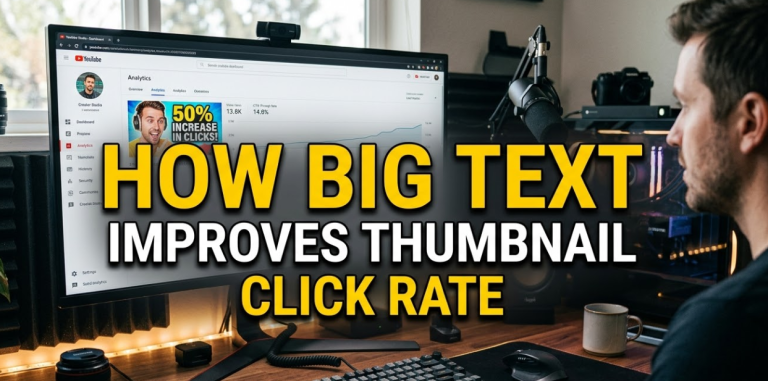
Here's a hard truth: most people scroll past your thumbnail without even blinking. You've got less than two seconds to grab their attention. That's it. Two seconds.
This is where big text improves thumbnail click rate in a way nothing else can. When your text is large, bold, and easy to read at a glance, people stop scrolling. They look. And then they click.
Big text isn't just a design trend. It's a proven psychological trigger. It tells the viewer, "Hey, this is important. Pay attention." And in a sea of competing thumbnails, that message matters more than ever.
In this article, you'll learn exactly why big text works, how to use it correctly, and what mistakes to avoid. Whether you're a YouTuber, a blogger, or a content creator on any platform, this guide will help you design thumbnails that actually get clicked.
The Science Behind Why Big Text Grabs Attention First
Your brain processes images before it reads words. But here's the interesting part — when text is large enough, your brain treats it like an image. It registers the shape and size of the words before it even reads them.
This is called pre-attentive processing. It happens automatically, without any effort on your part.
What Your Eyes Do in the First Second
When someone sees your thumbnail, their eyes don't read it line by line. Instead, they do a quick scan. They look for:
- High contrast areas
- Bold shapes and colors
- Large text blocks
Big text hits all three of these triggers at once. It's high contrast (usually), it creates a bold shape, and it's a large block that stands out visually.
How Font Size Affects Perceived Value
Here's something most creators don't know: the size of your text sends a message about your content's value.
Small text feels like a footnote. Big text feels like a headline. And people trust headlines. They click on headlines.
A study of YouTube thumbnails found that videos with readable, large text in their thumbnails had significantly higher click-through rates than those without any text. Why? Because the text gives context. It tells people what they're about to watch before they even click.
Big Text vs. No Text: A Direct Comparison
Let's break this down visually so it's crystal clear.
| Feature | Thumbnail With Big Text | Thumbnail Without Text |
|---|---|---|
| Viewer understands topic | ✅ Immediately | ❌ Must guess |
| Works on small screens | ✅ Yes | ⚠️ Sometimes |
| Stops the scroll | ✅ High chance | ⚠️ Depends on image |
| Adds emotional hook | ✅ Yes (with power words) | ❌ Rarely |
| Works at thumbnail size | ✅ Designed for it | ✅ Yes |
| Boosts click-through rate | ✅ Proven | ⚠️ Inconsistent |
The data is clear. Big text gives your thumbnail a massive advantage, especially on mobile devices where thumbnails are even smaller.
Mobile Screens Are Killing Small Text (Here's Why That Matters)
Over 70% of YouTube views come from mobile devices. Think about what that means for your thumbnail.
On a phone screen, a standard thumbnail is roughly the size of a playing card. Any text smaller than 40px in your original design will be nearly impossible to read at that size.
The Thumbnail Size Problem Nobody Talks About
Most creators design their thumbnails on a big desktop monitor. The text looks fine. Then the thumbnail goes live, and on a phone, it's a blurry mess of tiny letters nobody can read.
Big text solves this problem automatically. When your font is large and bold in the original design, it scales down well. It stays readable. It still grabs attention even on the smallest screens.
A Simple Size Test You Should Do Right Now
After designing your thumbnail, shrink it down to about 120 x 68 pixels. That's roughly how it looks on mobile search results. Can you still read the text? If not, make it bigger.
This one test alone can transform how you think about thumbnail design.
The Psychology of Big Text: Why It Feels Urgent and Important
Big text doesn't just help people see your thumbnail. It also changes how they feel about it.
Large fonts carry psychological weight. They signal importance. Think about newspaper headlines, warning signs, or movie posters. The most critical information is always in the biggest text. Your brain has been trained since childhood to treat big text as important.
Power Words + Big Text = Unstoppable Combo
When you combine large font size with emotionally charged words, you create a hook that's almost impossible to ignore. Words like:
- FREE
- WARNING
- NEVER
- SECRET
- BIGGEST
These words already trigger curiosity. Put them in big, bold text on your thumbnail, and you've got a scroll-stopper.
Why Curiosity Gaps Work Even Better With Big Text
A curiosity gap is when you hint at something without revealing everything. For example: "The Mistake That Cost Me $10,000" — you want to know what the mistake was.
Big text makes this curiosity gap impossible to miss. The viewer reads it instantly. The hook sets in. And then they click to find out more.
How Big Text Improves Thumbnail Click Rate Across Different Platforms
Big text isn't just a YouTube trick. It works across every major platform. Here's a platform-by-platform breakdown.
YouTube
YouTube thumbnails appear in search results, suggested videos, and the home feed. The competition is fierce. Big text helps your thumbnail stand out and instantly communicate your video's value.
Best practices for YouTube:
- Use 2–4 words maximum
- Bold, sans-serif fonts work best
- Use contrasting colors (e.g., yellow text on dark background)
Facebook and Instagram
Social media moves fast. People scroll through their feed at lightning speed. Big text stops that scroll in its tracks.
On Instagram, especially in Reels covers and post thumbnails, bold text with a clear message performs far better than image-only thumbnails.
Pinterest is a visual search engine. People search for ideas and inspiration. Big text on your Pin tells them exactly what they'll find if they click.
Pins with readable, large-text overlays tend to get saved and clicked far more often than image-only Pins.
Blog Featured Images
If you're a blogger, your featured image shows up in Google search, social shares, and email newsletters. A featured image with big, bold text that matches your blog post title creates consistency and trust — two things that drive clicks.
Thumbnail Text Design: The Rules That Actually Work
Not all big text is created equal. There's a right way and a wrong way to use text in thumbnails.
Rule #1 — Keep It Short
Your thumbnail text should be 5 words or fewer. Ideally, 2–3 words.
You're not writing a sentence. You're writing a headline that works in under two seconds. Short, punchy, and powerful.
| Too Long | Just Right |
|---|---|
| "How I Lost 30 Pounds in 3 Months Without Going to the Gym" | "Lost 30 Lbs — No Gym" |
| "The Best Ways to Make Money Online From Home in 2025" | "Earn Online in 2025" |
| "Everything You Need to Know About Starting a YouTube Channel" | "Start YouTube Today" |
Rule #2 — Use High Contrast Colors
Big text means nothing if you can't see it. Always make sure your text color contrasts sharply with the background.
High contrast combinations that work:
- White text on dark blue or black
- Yellow text on dark red or black
- Black text on white or yellow
- Orange text on navy blue
Avoid light text on light backgrounds. Avoid dark text on dark backgrounds. Contrast is everything.
Rule #3 — Use Bold, Sans-Serif Fonts
Thin fonts look elegant on a poster. On a thumbnail? They disappear.
Always use bold, chunky fonts that are easy to read at small sizes. Some popular choices:
- Impact (classic YouTube style)
- Anton
- Bebas Neue
- Montserrat Bold
- Oswald
These fonts are thick, strong, and readable even at tiny sizes. You can design amazing thumbnails with these fonts using tools like Canvix, which is built specifically for thumbnail creation with all the right design features.
Rule #4 — Don't Cover the Subject's Face
If your thumbnail features a person (maybe you making an expression), don't put text over their face. The face is what creates the emotional connection. The text supports it.
Put your text to the left or right of the face, or along the top or bottom of the thumbnail.
Rule #5 — Use Drop Shadows or Outlines on Text
Even with good contrast, text can sometimes get lost in a busy background. Adding a drop shadow or a dark outline to your text makes it pop off the screen.
This is a simple technique that makes a big difference, especially for thumbnails with complex or colorful backgrounds.
Real-World Data: What Happens When Creators Switch to Big Text
Let's look at what actually happens when creators make the switch.
Case Study: YouTuber Doubles CTR in 30 Days
A mid-size YouTube channel in the personal finance niche reported that after redesigning their thumbnails to include large, bold text with 3 words or fewer, their average click-through rate jumped from 3.2% to 6.7% in just 30 days. That's more than double.
They didn't change their video quality. They didn't change their upload schedule. They just changed their thumbnails.
Case Study: Pinterest Creator Sees 40% More Saves
A food blogger who switched from image-only Pins to Pins with large, readable text overlays saw a 40% increase in saves and a 25% increase in clicks over a 60-day period.
Again — same content. Better thumbnails. Better results.
What the Numbers Say Overall
| Thumbnail Type | Average CTR |
|---|---|
| No text, generic image | 2–3% |
| Small text, busy design | 3–4% |
| Big bold text, clean design | 5–9% |
| Big text + emotion/face | 7–12% |
These numbers make it obvious. Big text improves thumbnail click rate in a real, measurable way.
Common Mistakes That Ruin Big Text Thumbnails
Even with big text, you can still design a bad thumbnail. Here are the most common mistakes to avoid.
Mistake #1 — Using Too Many Words
More words don't mean more information. They mean more confusion. Keep it to 5 words max. If your text is wrapping onto three lines, cut it down.
Mistake #2 — Choosing Fonts That Are Hard to Read
Script fonts and decorative fonts look cool on Instagram stories. On thumbnails? They're impossible to read at small sizes. Always prioritize readability over style.
Mistake #3 — Putting Text Behind Objects
If your text gets hidden behind a person, a logo, or a prop in the image, it defeats the entire purpose. Always make sure your text is in front of everything else.
Mistake #4 — Using Low Contrast Text
Gray text on a white background. Dark blue text on a black background. These combinations are thumbnail killers. High contrast is non-negotiable.
Mistake #5 — Making Your Text Too Fancy
Gradients, patterns, and special effects on text can look great in theory. But when your thumbnail is scaled down to mobile size, all that fancy stuff turns into visual noise. Keep your text clean and bold.
How to Write Thumbnail Text That Makes People Click
Designing big text is one thing. Writing the right words is another. Here's how to craft thumbnail text that converts.
Use Numbers When You Can
Numbers in thumbnails work because they're specific and credible. "7 Ways to Save Money" is more clickable than "Ways to Save Money."
Numbers also break the visual pattern of the surrounding thumbnails, which makes them stand out even more.
Trigger Emotion
The best thumbnail text makes the viewer feel something. Curiosity, excitement, fear of missing out, or even mild shock.
Examples:
- "Big Mistake" — triggers fear
- "Finally Works" — triggers relief
- "You Won't Believe" — triggers curiosity
- "I Quit" — triggers shock
Ask a Question
Questions naturally invite a response. When your thumbnail text is a question, the viewer's brain automatically tries to answer it — and the only way to get the answer is to click.
Examples:
- "Still Losing?"
- "Doing This Wrong?"
- "Worth It?"
Short, punchy questions in big text are incredibly effective.
Tools to Create Thumbnails With Big Text (Free and Paid)
You don't need to be a graphic designer to make great thumbnails. These tools make it easy.
| Tool | Best For | Price |
|---|---|---|
| Canvix | YouTube thumbnails with smart design tools | Free/Paid |
| Canva | General graphic design | Free/Paid |
| Adobe Express | Quick, professional designs | Free/Paid |
| Photoshop | Advanced editing and effects | Paid |
| Snappa | Simple, fast thumbnail creation | Free/Paid |
| Fotor | Easy online photo editing | Free/Paid |
For most creators, starting with a tool like Canvix is the smart move. It's designed specifically for thumbnails, which means the features you need most are front and center. You can also learn more about thumbnail design principles from resources like Google's Visual Elements Guide to understand how search engines interact with image content.
Building a Consistent Thumbnail Style With Big Text
Consistency builds trust. When your audience sees a thumbnail in their feed, they should recognize it as yours instantly.
Create a Thumbnail Template
Pick your font, your colors, and your layout. Stick with them across all your thumbnails. Over time, your audience will recognize your style before they even read the text.
Test, Track, and Improve
Most platforms offer analytics. On YouTube, you can see your CTR for every video. Use this data.
When a thumbnail performs well, study it. What text did you use? What color? What font size? Apply those lessons to your next thumbnail.
When a thumbnail underperforms, change it. YouTube lets you swap out thumbnails after upload. Don't be afraid to test multiple versions.
A/B Test Your Thumbnails
Some creators run A/B tests — they upload two different thumbnails and see which one gets more clicks. This is the fastest way to learn what works for your specific audience.
FAQs: Big Text and Thumbnail Click Rate
Q: How big should the text be on a thumbnail?
For a standard YouTube thumbnail (1280 x 720 pixels), your main text should be at least 80–120px. This ensures it stays readable when scaled down to mobile size. If in doubt, always go bigger.
Q: How many words should I put on a thumbnail?
Stick to 2–5 words. The shorter the better. Your text should be a hook, not a full sentence. Think of it like a billboard — you need the message to land in under two seconds.
Q: Does text on thumbnails hurt SEO?
No. Text on thumbnails doesn't directly affect SEO in a negative way. However, it does improve your click-through rate, which is a positive SEO signal — especially on YouTube, where CTR directly impacts how often your video gets recommended.
Q: What fonts work best for thumbnail text?
Bold, sans-serif fonts are the gold standard. Impact, Anton, Bebas Neue, Oswald, and Montserrat Bold are all excellent choices. Avoid thin fonts, script fonts, or decorative fonts that are hard to read at small sizes.
Q: Should I use the same text as my video title?
Not always. Your thumbnail text should be a teaser — it can be a shortened version of your title, a power word from your title, or a completely different emotional hook. The goal is curiosity and clicks, not repetition.
Q: Can too much text hurt my thumbnail?
Yes. More than 5–6 words starts to crowd the design and overwhelm the viewer. Too much text also makes each word smaller, which defeats the purpose of having big text in the first place. Keep it tight.
Q: Do all successful YouTubers use big text?
Most do, especially in competitive niches. However, some established channels with huge audiences rely more on facial expressions and visual storytelling. For growing channels, big text is one of the most reliable tools to increase clicks and grow faster.
The Bottom Line on Big Text and Click Rate
Here's what it all comes down to: big text improves thumbnail click rate because it communicates faster, reads better on mobile, triggers psychological responses, and gives your audience a clear reason to click.
Every second your thumbnail is on someone's screen, it's competing with dozens of others. Big, bold, readable text cuts through that noise instantly.
You don't need to be a designer. You don't need expensive software. You just need to commit to a few simple principles: keep the text short, make it bold, choose high contrast colors, and write words that spark emotion or curiosity.
Do that consistently, and your click-through rate will climb. Your videos will get more views. Your channel will grow faster.
The fix was simple all along. Make the text bigger.
