You spend hours making a great video. You hit upload. And then… crickets.
The problem might not be your content. It might be your thumbnail.
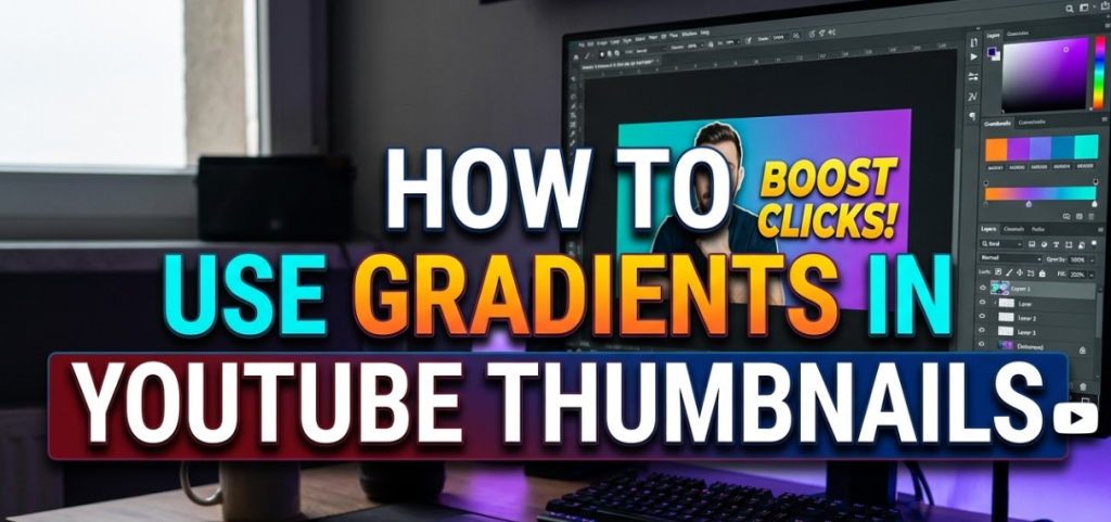
Using gradients in YouTube thumbnails is one of the most overlooked tricks to make your videos stand out in a crowded feed. A gradient is simply a smooth blend from one color to another — and when done right, it makes your thumbnail look professional, eye-catching, and impossible to scroll past.
This guide breaks down everything you need to know about gradients in YouTube thumbnails — from the basics to advanced tricks — in plain, easy-to-follow language. No design degree required.
What Is a Gradient, Anyway?
Before we dive in, let's make sure we're on the same page.
A gradient is when one color slowly fades into another. Think of a sunset — the sky starts as deep orange near the horizon, then blends into pink, then purple, then dark blue at the top. That smooth color transition? That's a gradient.
In a YouTube thumbnail, gradients can be used in the background, behind text, or as an overlay on top of a photo. They add depth, emotion, and a polished look that flat, single-color designs often lack.
The 4 Main Types of Gradients Used in Thumbnails
Not all gradients work the same way. Here are the four most common types creators use — and when to use each one.
1. Linear Gradients — The Classic Choice
A linear gradient flows in a straight line — left to right, top to bottom, or diagonally. This is the most common type you'll see in YouTube thumbnails.
Best for: Background designs, text legibility overlays, splitting two subjects visually.
Example: A thumbnail that starts with a bright yellow on the left and fades to deep orange on the right creates energy and movement without needing any extra elements.
2. Radial Gradients — Draw the Eye to the Center
A radial gradient spreads outward from a center point, like a spotlight or a sunburst effect. The brightest or strongest color sits in the middle, and it fades toward the edges.
Best for: Highlighting a face or product in the center of the thumbnail. Creating a "glowing" or dramatic effect around your subject.
Example: A dark background with a soft white radial glow behind your subject makes them pop like they're lit by a professional studio light.
3. Overlay Gradients — Make Photos Look Designed
An overlay gradient is placed on top of a photo. It's often semi-transparent, giving the image a color wash while still letting the photo show through.
Best for: Making busy or distracting background photos look clean. Adding brand colors to real-life photos without hiding them entirely.
Example: A photo of a city skyline with a deep blue overlay gradient makes it look branded and intentional — not just a random screenshot.
4. Text-Fade Gradients — Where Readability Meets Style
This gradient is placed specifically behind text — usually fading from a dark, semi-transparent color to fully transparent. The result: your text is readable, but the background image is still partially visible.
Best for: Adding titles or labels directly over photos without a plain color box behind the words.
Example: A dark gradient at the bottom of a thumbnail fades upward into transparency. White text sits over that dark area and reads perfectly — while the rest of the photo stays clean.
The chart above shows which gradient types top creators rely on most
Linear gradients dominate at 54%, followed by radial at 22%, overlay at 15%, and text-fade at 9%. Understanding this split helps you choose the right style for your niche.
How Gradients Actually Improve Click-Through Rates
Let's talk about why this matters — not just what looks cool.
YouTube thumbnails compete in a grid. Your thumbnail is roughly 168 × 94 pixels when someone browses on mobile. At that size, complexity disappears. What stands out is contrast, color, and clarity.
Gradients help in three specific ways:
First, they create contrast. A gradient behind your text ensures the words pop even on a noisy background. Without contrast, text gets lost.
Second, they guide the eye. A well-placed linear gradient pulls the viewer's attention from one part of the thumbnail to another — usually from the visual hook toward the face or text.
Third, they make thumbnails look professional. Flat, colorless backgrounds look amateur. A smooth, intentional gradient signals that the creator cares about presentation — which signals the content is high quality too.
Tools You Can Use to Add Gradients to Your Thumbnails
You don't need expensive software. Here are the most beginner-friendly options:
| Tool | Best For | Cost | Gradient Features |
|---|---|---|---|
| Canva | Beginners, fast design | Free / Pro | Linear, radial, custom stops |
| Adobe Photoshop | Advanced control | Paid | Full gradient editor |
| Adobe Express | Quick mobile editing | Free / Pro | Pre-set gradient overlays |
| Figma | Designer-level precision | Free / Pro | Full gradient panel |
| PicsArt | Mobile creators | Free / Pro | Gradient backgrounds & overlays |
For most creators just starting out, Canva is the best pick. It's free, intuitive, and has solid gradient tools built right in. You can also check out Canvix for additional thumbnail design resources tailored to YouTube creators.
Step-by-Step: Adding a Gradient Background in Canva
Here's exactly how to create a gradient background for your YouTube thumbnail in Canva.
Step 1 — Set Up the Right Canvas Size
Open Canva and start a new design. Set the dimensions to 1280 × 720 pixels. This is the standard YouTube thumbnail size.
Step 2 — Add a Background Rectangle
Click on "Elements" in the left panel. Search for a plain rectangle. Drag it to cover the entire canvas.
Step 3 — Open the Color Picker
With the rectangle selected, click on the color box in the top toolbar. This opens the color picker.
Step 4 — Switch to Gradient Mode
At the top of the color picker, you'll see two circle icons — one solid, one with a gradient. Click the gradient icon. Canva will immediately apply a default gradient (usually black to white).
Step 5 — Customize Your Colors
Click on each color stop (the little circles at either end of the gradient slider) to change the colors. Choose colors that match your brand or the mood of your video.
Step 6 — Adjust the Direction
Below the color controls, you'll see options to rotate or flip the gradient. Drag the angle wheel or type in a degree value to control which direction the gradient flows.
Step 7 — Overlay Your Other Elements
Now add your text, face image, and any icons on top of the gradient background. Use the layering panel to make sure your background sits behind everything else.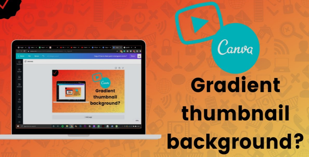
Color Psychology: Picking the Right Gradient Colors
The colors you choose aren't just about looking cool. They send signals to the viewer's brain before they even read a word.
Here's a quick reference:
| Color Combination | Emotional Signal | Best Niche |
|---|---|---|
| Red → Orange | Energy, urgency, excitement | Gaming, fitness, news |
| Blue → Purple | Trust, mystery, depth | Tech, finance, education |
| Yellow → Gold | Optimism, wealth, warmth | Lifestyle, travel, motivation |
| Black → Dark Blue | Luxury, seriousness, power | Business, documentary, drama |
| Green → Teal | Nature, calm, freshness | Health, wellness, outdoors |
| Pink → Purple | Creativity, fun, youthfulness | Beauty, fashion, lifestyle |
Pro tip: Stick to two colors per gradient. Three or more color stops can look messy at thumbnail size unless you're very precise.
Gradient Overlay on a Photo: The Right Way to Do It
Using a gradient over a real photo is one of the most powerful thumbnail techniques — but it's easy to mess up. Here's how to get it right.
Keep the Opacity Between 40–70%
If your overlay is too dark, it buries the photo. Too light, and the gradient has no effect. For most thumbnails, a semi-transparent overlay between 40% and 70% opacity hits the sweet spot.
Use a Color That Complements the Photo
If your photo has warm tones (golden hour lighting, skin tones, fire), use a warm gradient overlay. If the photo is cool (blue sky, water, night scene), use a cool overlay. Fighting the photo's natural colors creates visual noise.
Avoid Gradients That Fade to Bright White
A gradient fading to white tends to wash out your image and makes text almost impossible to read on the lighter end. Instead, fade to a very light version of your main color — not pure white.
Common Gradient Mistakes That Kill Your CTR
Even experienced creators fall into these traps. Here's what to avoid:
Mistake 1 — Too Many Colors More than two colors in one gradient usually looks chaotic at small sizes. Keep it simple.
Mistake 2 — Low Contrast Against Text A mid-tone gradient (neither light nor dark) makes every text color look muddy. If you're placing text over a gradient, make sure there's a clear contrast zone — either dark gradient under light text, or light gradient under dark text.
Mistake 3 — Gradients That Don't Fit the Mood A pastel pink-to-lavender gradient looks out of place on a gaming or finance thumbnail. Match the gradient palette to your content's tone and audience.
Mistake 4 — Ignoring Mobile Viewers More than 70% of YouTube views happen on mobile. Always check how your gradient thumbnail looks on a phone screen. Colors that look stunning on a 27-inch monitor can look flat on a 5-inch phone if the contrast isn't strong enough.
Mistake 5 — Copying Gradients Without Consistency Switching gradient styles every video breaks visual brand recognition. Viewers should be able to glance at your thumbnail grid and immediately recognize your channel.
How to Build a Consistent Gradient Brand Style
If you want viewers to recognize your videos at a glance, consistency is everything. Here's how to build a gradient style that sticks.
Pick 2–3 Brand Colors
Choose two primary colors and one accent. These should match your channel's overall feel — energetic, calm, professional, or playful. Every gradient you create should use these same shades.
Create a Gradient Template
Build one master thumbnail template in Canva or your tool of choice. Lock the gradient background layer. Save this as your default starting point for every new thumbnail.
Document Your Color Codes
Write down the exact hex codes for your gradient colors somewhere safe. This ensures the purple in Week 1's thumbnail is the exact same purple in Week 50's thumbnail.
You can learn more about building visual brand consistency in design from resources like Adobe's Color Wheel tool — a free resource that helps you find harmonious color pairs for gradients.
Advanced Gradient Techniques for Experienced Creators
If you've mastered the basics, here are some higher-level techniques to take your thumbnails further.
Split-Screen Gradients
Divide your thumbnail into two halves — left and right — with contrasting gradients. The left side might be warm (orange to red) and the right side cool (blue to purple). This technique works great for "vs." thumbnails or comparison content.
Gradient Text Fill
Instead of a plain color for your headline text, apply a gradient directly inside the letters. This creates a premium, designed look. In Canva, you can do this by using a colored text layer with a clipping mask over a gradient shape.
Layered Gradient Depth
Use two separate gradient layers — one as your background, one as a subtle overlay on your foreground element (like the subject's silhouette). The slight difference in gradient direction between layers creates a sense of depth and dimension.
Neon Glow Gradients
Popular in gaming and tech thumbnails, this technique uses a dark background with bright, saturated neon color gradients radiating outward. Electric blue to cyan, or hot pink to magenta, are common neon gradient pairs. The effect is bold and stops the scroll instantly.
Gradient Dos and Don'ts at a Glance
Here's a quick summary table you can reference whenever you're designing:
| Do This | Don't Do This |
|---|---|
| Use 2 complementary colors | Use 4+ colors in one gradient |
| Match gradient mood to content tone | Use random trendy colors with no theme |
| Check contrast on mobile | Only preview on a large monitor |
| Keep a consistent brand gradient | Change your color style every week |
| Fade to dark behind text for readability | Fade to white under white text |
| Use radial gradient to spotlight subject | Center a radial glow in empty space |
Quick Thumbnail Checklist Before You Publish
Before you hit "save" on your thumbnail, run through this fast checklist:
- Is the gradient direction leading the eye toward your main subject?
- Is there enough contrast between your text and the gradient underneath it?
- Does the color combination match the emotion you want the viewer to feel?
- Have you previewed it at thumbnail size (around 168 × 94 px on screen)?
- Does this gradient fit your existing channel brand?
If you can check every box, your thumbnail is ready.
FAQs About Gradients in YouTube Thumbnails
Q: Do I need design experience to use gradients in my thumbnails?
Not at all. Tools like Canva have one-click gradient presets that look great right out of the box. You can customize from there as you get more comfortable.
Q: How many colors should I use in a gradient?
Two colors is the sweet spot for most thumbnails. Three can work if they're closely related in tone (like light blue → mid blue → deep blue). Avoid anything beyond three — it gets messy fast at small sizes.
Q: Should my gradient match my channel banner?
Yes, ideally. Using the same gradient palette across your banner, profile image, and thumbnails creates a cohesive brand that viewers remember. Consistency builds trust and recognition over time.
Q: Can I use gradients on top of real photos in my thumbnails?
Absolutely. This is one of the most effective techniques. Use a semi-transparent gradient overlay (40–70% opacity) to add brand color to a photo while keeping the image visible beneath it.
Q: What's the best gradient for gaming thumbnails?
Dark backgrounds with neon gradients — think deep black to electric blue, or dark navy to hot magenta — tend to perform well in gaming. They signal intensity and excitement, which aligns with what gaming viewers are looking for.
Q: Are gradients still trending in YouTube thumbnails?
Yes. Gradient backgrounds and overlays have been a consistent part of top-performing thumbnail designs for years. Unlike some design fads, gradients remain effective because they're functional — they improve contrast, add depth, and guide the viewer's eye.
Q: What size should my YouTube thumbnail be?
The recommended size is 1280 × 720 pixels with a minimum width of 640 pixels. The aspect ratio is 16:9. Always design at full resolution and then preview at thumbnail size to make sure your gradient and text still read clearly when small.
Q: How do I make sure my gradient thumbnail looks good on dark mode?
Test your thumbnail on both a white background and a dark background. Some gradients that pop on light mode can look muddy or washed out on dark mode. Brighter, more saturated gradients tend to work better across both viewing modes.
Wrap-Up: Start Using Gradients in Your Thumbnails Today
Gradients aren't just decoration. They're one of the fastest, most accessible ways to make your YouTube thumbnails look intentional, professional, and scroll-stopping — without needing any advanced design skills.
To recap the key points: gradients in YouTube thumbnails work by improving contrast, guiding the viewer's eye, and giving your videos a polished visual identity. Linear gradients are the most versatile starting point. Radial gradients spotlight your subject. Overlay gradients transform photos into branded visuals. Text-fade gradients solve the readability problem without sacrificing aesthetics.
Pick a two-color palette that fits your channel's mood, build a consistent template, and start applying it to every thumbnail you publish from here on. The results — better click-through rates, stronger brand recognition, and a more professional-looking channel — are worth every minute you invest.
Now open Canva, pick your two colors, and start blending.
