Short-form video platforms have changed how people consume content online. Whether you upload videos on YouTube Shorts, Instagram Reels, TikTok, or other short-video platforms, grabbing attention instantly is the key to success. Even though many Shorts autoplay in feeds, thumbnails still play a powerful role in attracting viewers, especially when your content appears in search results, channel pages, suggested feeds, or playlists.
A well-designed thumbnail can significantly improve your click-through rate (CTR), increase views, and help your content stand out in crowded feeds. On the other hand, a dull or confusing thumbnail can cause viewers to skip your video completely.
In this detailed guide, you will learn how to design thumbnails for Shorts, including design principles, tools, color psychology, text strategies, and proven techniques used by successful creators.
Why Thumbnails Still Matter for Shorts
Many creators believe thumbnails are not important for short videos. This is partly true because Shorts often autoplay. However, thumbnails still matter in several situations.
Places Where Shorts Thumbnails Appear
-
On your YouTube channel homepage
-
In YouTube search results
-
Inside playlists
-
In suggested videos
-
On social media previews
-
In shared links
If your thumbnail stands out, viewers are more likely to click your video instead of others.
Impact of Thumbnails on Video Performance
| Factor | Weak Thumbnail | Strong Thumbnail |
|---|---|---|
| Click-Through Rate | Low | High |
| Viewer Curiosity | Minimal | Strong |
| Channel Branding | Poor | Recognizable |
| Watch Growth | Slow | Faster |
A compelling thumbnail can dramatically increase engagement and help your Shorts perform better in algorithms.
Ideal Thumbnail Size and Format for Shorts
Before designing your thumbnail, you must understand the recommended size and format.
Standard Thumbnail Specifications
| Element | Recommended Value |
|---|---|
| Resolution | 1280 × 720 pixels |
| Minimum Width | 640 pixels |
| Aspect Ratio | 16:9 |
| File Format | JPG, PNG |
| Maximum Size | 2 MB |
However, because Shorts videos are vertical, your thumbnail design should focus on the center area so it looks good in both vertical and horizontal previews.
Vertical Safe Zone Tip
Design thumbnails with a vertical subject focus, leaving enough space on the sides. This ensures your thumbnail still looks clear in Shorts displays.
Step-by-Step Guide to Designing Shorts Thumbnails
Creating eye-catching thumbnails is a process. Follow these steps to design thumbnails that attract viewers.
1. Start With a Clear Concept
Before opening any design software, ask yourself:
-
What is the main message of the Short?
-
What emotion should viewers feel?
-
What moment from the video is most exciting?
Your thumbnail should instantly answer the question: “Why should I watch this?”
Example thumbnail ideas:
-
A surprised facial expression
-
A dramatic before/after moment
-
A bold statement or question
-
A shocking result
2. Use Bold and Bright Colors
Color is one of the strongest attention triggers. Bright and contrasting colors make thumbnails stand out in crowded feeds.
Popular Color Combinations
| Background Color | Text Color | Effect |
|---|---|---|
| Yellow | Black | Very eye-catching |
| Red | White | Urgency and excitement |
| Blue | Yellow | Clean and modern |
| Purple | White | Creative and bold |
Color Psychology in Thumbnails
-
Red: urgency, excitement
-
Yellow: curiosity, attention
-
Blue: trust and calmness
-
Green: growth and success
Using high contrast helps viewers notice your thumbnail quickly.
3. Add a Clear Subject
The best thumbnails focus on one main element instead of many.
Good examples include:
-
A person’s face showing emotion
-
A product close-up
-
A surprising result
-
A reaction moment
Avoid clutter. Too many objects make thumbnails confusing.
The Rule of One
Your thumbnail should highlight one clear idea.
Example:
Bad thumbnail:
Laptop + phone + chart + money + text + background objects
Good thumbnail:
One shocked face + big profit number
4. Use Faces and Emotions
Human faces attract attention naturally. Many viral Shorts use expressive facial reactions.
Popular expressions include:
-
Shock
-
Excitement
-
Fear
-
Happiness
-
Curiosity
Why Faces Work
Research in digital marketing shows that people are drawn to human expressions. Emotional faces make viewers curious about what happened in the video.
Example emotions that increase clicks:
-
Wide eyes
-
Open mouth surprise
-
Big smile
-
Confused reaction
5. Keep Text Short and Powerful
Shorts thumbnails should never contain long sentences. Instead, use 3 to 5 powerful words.
Examples:
Good thumbnail text:
-
“I Tried This!”
-
“Secret Trick”
-
“Wait For It!”
-
“Don’t Do This”
Bad thumbnail text:
“This is the best method you should try today to grow faster.”
Short text works better because viewers only glance at thumbnails for a fraction of a second.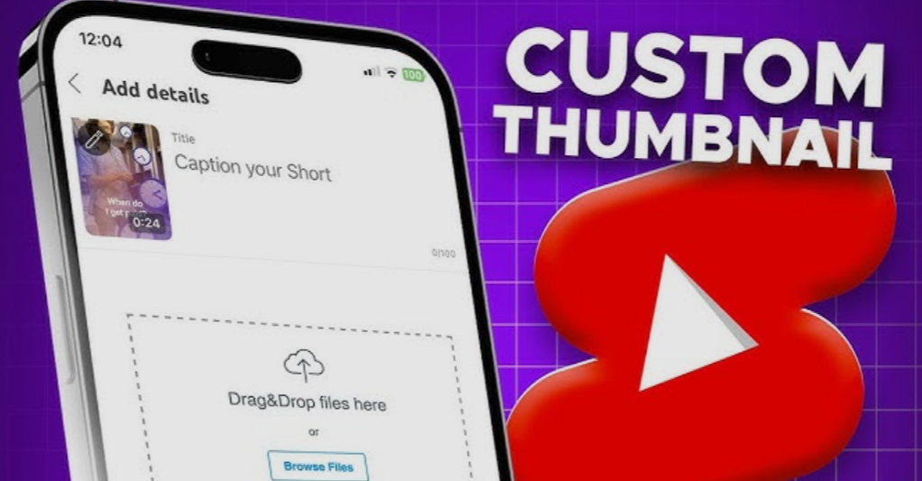
6. Use Large and Readable Fonts
Your text must be readable even on small mobile screens.
Best Font Tips
-
Use bold fonts
-
Avoid thin or fancy fonts
-
Use high contrast
-
Add text outlines or shadows
Example Font Styles
| Font Style | Readability |
|---|---|
| Bold Sans Serif | Excellent |
| Script Font | Poor |
| Thin Font | Difficult |
| Block Letters | Very Good |
7. Highlight Important Elements With Shapes
Shapes can guide viewers’ attention.
Popular design elements include:
-
Arrows
-
Circles
-
Highlights
-
Zoom effects
Example uses:
-
Circle around a surprising detail
-
Arrow pointing to the main object
-
Glow around a product
These simple visual cues help viewers understand the thumbnail quickly.
Best Tools to Create Shorts Thumbnails
You don’t need expensive software to design great thumbnails. Many free tools are available.
Popular Thumbnail Design Tools
| Tool | Best For | Difficulty |
|---|---|---|
| Canva | Beginners | Easy |
| Photoshop | Professionals | Advanced |
| Figma | UI designers | Medium |
| Snappa | Quick thumbnails | Easy |
| Pixlr | Free editing | Medium |
Why Canva Is Popular
Canva offers:
-
Ready-made thumbnail templates
-
Drag-and-drop interface
-
Free images and icons
-
Easy text editing
Many beginners create professional thumbnails in minutes using Canva.
Thumbnail Layout Styles That Work for Shorts
Different thumbnail layouts perform well depending on your content type.
Layout Style 1: Face + Reaction
This style is widely used by vloggers.
Structure:
Face on one side
Text on the other side
Benefits:
-
Emotional connection
-
Clear message
Layout Style 2: Before vs After
This works well for tutorials and transformations.
Example:
| Before | After |
|---|---|
| Messy room | Clean room |
| Bad design | Professional design |
The contrast creates curiosity.
Layout Style 3: Question Thumbnail
Questions trigger curiosity.
Examples:
-
“Is This Real?”
-
“Does It Work?”
-
“Worth It?”
Viewers click to find the answer.
Layout Style 4: Mystery Thumbnail
Mystery thumbnails hide part of the information.
Examples:
-
Blurred object
-
Covered product
-
Hidden result
Curiosity encourages clicks.
Thumbnail Mistakes That Kill Views
Many creators unknowingly make mistakes that reduce video performance.
1. Too Much Text
Long text becomes unreadable on mobile devices.
2. Cluttered Design
Too many objects confuse viewers.
3. Low Quality Images
Blurry thumbnails look unprofessional.
4. Misleading Content
Clickbait that doesn’t match the video can reduce watch time and damage trust.
5. Poor Color Contrast
If text blends with the background, viewers won’t notice it.
Simple Thumbnail Design Workflow
Here is a practical workflow used by many creators.
Step-by-Step Process
-
Pick the most exciting moment from the video.
-
Take a high-quality screenshot.
-
Open your design tool.
-
Add bold colors or background.
-
Insert short text (3–5 words).
-
Add arrows or highlights.
-
Check readability on mobile size.
-
Export in 1280×720 resolution.
This process usually takes 5–10 minutes once you get used to it.
Thumbnail CTR Optimization Tips
CTR (Click Through Rate) shows how often people click your video after seeing it.
Factors That Increase CTR
-
High contrast colors
-
Emotional reactions
-
Curiosity text
-
Clear subject
-
Simple layout
Example CTR Comparison
| Thumbnail Type | Average CTR |
|---|---|
| Generic screenshot | 2–3% |
| Basic edited thumbnail | 4–6% |
| Optimized thumbnail | 8–12% |
Small improvements in CTR can lead to thousands of extra views.
A Simple Thumbnail Design Formula
Many successful creators follow a simple formula.
The 4-Element Thumbnail Formula
-
Emotion
-
Curiosity
-
Contrast
-
Clarity
If your thumbnail includes these four elements, it will likely perform well.
Thumbnail Design Infographic
Here is a simple visual breakdown of an effective thumbnail structure.
Key takeaway:
Focus on one subject + bold text + strong contrast.
Testing Different Thumbnails
Successful creators often test multiple thumbnails.
A/B Testing Strategy
Create two versions:
-
Thumbnail A: Reaction face
-
Thumbnail B: Question text
Upload one version first. If performance is low, change the thumbnail after 24–48 hours.
Many videos go viral after thumbnail changes.
Branding Your Shorts Thumbnails
Consistent branding helps viewers recognize your content instantly.
Branding Elements
You can include:
-
Consistent color palette
-
Same font style
-
Logo or watermark
-
Similar layout
Example branding strategy:
| Element | Example |
|---|---|
| Color | Yellow + Black |
| Font | Bold Sans Serif |
| Layout | Face + text |
After several uploads, viewers will recognize your videos quickly.
Mobile Optimization Tips
Most Shorts viewers watch videos on phones. Your thumbnail must look good on small screens.
Mobile Design Rules
-
Keep text large
-
Avoid tiny details
-
Use simple backgrounds
-
Focus on one subject
Before uploading, zoom out your thumbnail to 10% size. If you can still read it clearly, it will work well on mobile.
Thumbnail Ideas for Different Niches
Different content categories require different thumbnail styles.
Gaming Shorts
-
Character reactions
-
Bright colors
-
Action moments
Educational Shorts
-
Question-based text
-
Highlighted concept
-
Clear diagrams
Tech Shorts
-
Product close-up
-
Feature highlight
-
Comparison visuals
Lifestyle Shorts
-
Facial reactions
-
Transformation shots
-
Emotional storytelling
Choosing the right style helps attract your target audience.
The Future of Shorts Thumbnails
Short-form video platforms continue evolving, but thumbnails remain an important visual marketing tool.
As competition increases, creators who master thumbnail design will gain a strong advantage.
Future trends may include:
-
AI-generated thumbnails
-
Dynamic thumbnails
-
Personalized previews
-
Interactive designs
Creators who experiment and adapt will stay ahead.
Final Thoughts
Designing thumbnails for Shorts is not just about making images look attractive. It is about communicating a story instantly.
The best thumbnails are simple, emotional, and curiosity-driven. They grab attention within seconds and convince viewers to click.
To recap, an effective Shorts thumbnail should:
-
Use bright and contrasting colors
-
Focus on one clear subject
-
Include short, bold text
-
Show emotion or curiosity
-
Stay clean and uncluttered
Even small improvements in your thumbnail design can dramatically increase your views and channel growth.
If you consistently apply the strategies discussed in this guide—such as strong color contrast, emotional expressions, readable text, and curiosity triggers—you will be able to create thumbnails that stand out and attract more viewers to your Shorts.
Mastering thumbnail design takes practice, but once you develop your style, it becomes one of the most powerful tools for growing your content online.
