Guide for High Click-Through Videos)
YouTube challenges attract millions of viewers every day. From eating spicy foods to completing extreme dares, challenge videos dominate trending pages. But there is one hidden factor behind most viral challenge videos: the thumbnail.
A powerful thumbnail can turn a normal video into a viral hit. It is the first thing viewers see before they decide whether to click your video or scroll away.
If your thumbnail grabs attention, sparks curiosity, and clearly shows the challenge, your click-through rate (CTR) increases. Higher CTR often means more views, more engagement, and a better chance of your video going viral.
This guide will teach you how to create viral challenge thumbnails step-by-step, even if you are a beginner. You’ll learn the design techniques used by top creators, the psychology behind clickable thumbnails, and practical tools to create eye-catching designs.
Why Challenge Thumbnails Matter More Than Ever
Before someone watches your video, they see two things:
-
Thumbnail
-
Title
If the thumbnail fails, the video rarely gets clicks.
According to many YouTube analytics studies, thumbnails can influence over 70% of click decisions.
Challenge videos are especially competitive. Thousands of creators upload similar content such as:
-
Last to leave challenges
-
Extreme food challenges
-
$1000 vs $10 challenges
-
24-hour survival challenges
-
Mystery box challenges
Because many videos look similar, the thumbnail must instantly stand out.
What a Good Challenge Thumbnail Achieves
A viral thumbnail usually does three things:
-
Stops scrolling
-
Shows the challenge clearly
-
Creates curiosity
Think about it like a movie poster. If the poster looks boring, nobody watches the movie.
The Psychology Behind Clickable Thumbnails
Before designing a thumbnail, it helps to understand why people click.
Human brains react quickly to visual signals like:
-
Bright colors
-
Faces with strong emotions
-
Big objects
-
Unusual situations
-
High contrast
Challenge thumbnails that go viral usually trigger curiosity and excitement.
Common Curiosity Triggers
| Trigger Type | Example | Why It Works |
|---|---|---|
| Extreme situation | Giant spicy noodle bowl | Looks shocking |
| Competition | “Last to Leave Wins $10,000” | Viewers want to see the winner |
| Mystery | Hidden box or blurred object | People want the answer |
| Risk | Dangerous or difficult tasks | Creates tension |
| Transformation | Before vs After | Shows change |
When designing your thumbnail, ask yourself:
“Would someone stop scrolling when they see this?”
Key Elements of a Viral Challenge Thumbnail
A strong thumbnail usually contains five essential parts.
1. A Clear Main Subject
Your thumbnail must focus on one main subject.
Avoid clutter.
Good examples:
-
A giant burger
-
A mystery box
-
A timer counting down
-
A mountain of spicy noodles
Bad examples:
-
Too many objects
-
Busy backgrounds
-
Tiny details
Keep the subject large and centered.
2. Emotional Facial Expressions
Faces dramatically increase clicks.
Many successful YouTubers exaggerate emotions such as:
-
Shock
-
Fear
-
Excitement
-
Confusion
-
Pain (for spicy challenges)
These expressions tell viewers something crazy is happening.
Example:
| Expression | Use Case |
|---|---|
| Shocked face | Unexpected result |
| Pain reaction | Spicy or extreme challenge |
| Laughing | Fun competition |
| Confused | Mystery challenge |
Tip: Zoom in on the face so it fills a large part of the thumbnail.
3. Big, Bold Text
Challenge thumbnails often include 2–4 powerful words.
Examples:
-
LAST TO LEAVE
-
SPICIEST FOOD
-
$10,000 WINNER
-
24 HOURS
Text should be:
-
Large
-
Bold
-
Easy to read on mobile
Remember: Most viewers watch on phones.
4. Bright Colors and High Contrast
Colors help thumbnails stand out on crowded pages.
High-performing thumbnails often use:
| Color | Why It Works |
|---|---|
| Red | Urgency and excitement |
| Yellow | Highly visible |
| Blue | Strong contrast |
| Green | Fresh and vibrant |
Color Contrast Example
| Background | Text Color |
|---|---|
| Dark | White |
| Yellow | Black |
| Red | White |
High contrast ensures viewers can read text instantly.
5. Simple Backgrounds
Too many details distract viewers.
Use backgrounds such as:
-
Solid colors
-
Blurred environments
-
Simple rooms
-
Outdoor scenes
Your main subject should always stand out.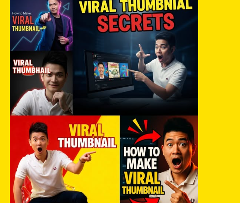
Step-by-Step Process to Design a Viral Challenge Thumbnail
Here is a simple workflow many successful creators follow.
Step 1: Pick the Most Exciting Moment
Your thumbnail should represent the most intense part of the challenge.
Examples:
-
The moment someone eats the spiciest food
-
Someone almost losing a challenge
-
The biggest item in the challenge
-
A shocked reaction
Think about the peak moment of the video.
Step 2: Capture a High-Quality Screenshot
A blurry thumbnail rarely gets clicks.
Tips for screenshots:
-
Use 1080p or higher video
-
Pause during strong reactions
-
Choose frames with clear facial expressions
-
Avoid motion blur
You can also take separate photos for thumbnails before filming.
Many creators do this.
Step 3: Remove Background Distractions
Use editing tools to simplify the image.
You can:
-
Blur the background
-
Remove unwanted objects
-
Add glow around the subject
This makes the main subject pop.
Step 4: Add Visual Effects
Challenge thumbnails often include visual effects such as:
-
Arrows
-
Circles
-
Explosions
-
Lightning effects
-
Glow highlights
But use them carefully.
Too many effects can make thumbnails look messy.
Step 5: Add Minimal Text
Limit text to 2–4 words.
Good examples:
-
SPICY CHALLENGE
-
LAST TO LEAVE
-
$10 vs $10,000
-
24 HOURS
Short text increases readability.
Step 6: Export in the Correct Size
YouTube recommends:
| Setting | Value |
|---|---|
| Resolution | 1280 × 720 |
| Aspect Ratio | 16:9 |
| Format | JPG or PNG |
| File Size | Under 2 MB |
These settings ensure your thumbnail looks sharp on all devices.
Thumbnail Design Layout That Often Goes Viral
Here is a common layout used by popular challenge videos.
| Area | Content |
|---|---|
| Left Side | Face reaction |
| Center | Main object or challenge |
| Right Side | Competitor or second object |
| Top/Bottom | Short text |
This layout works well because it tells a story quickly.
Thumbnail Example Structure (Visual Concept)
Below is a simplified infographic structure.
This tells viewers everything instantly.
Best Tools for Creating Challenge Thumbnails
You don’t need expensive software.
Many creators use beginner-friendly tools.
Free Tools
| Tool | Features |
|---|---|
| Canva | Easy templates |
| Photopea | Photoshop-like editor |
| Pixlr | Quick online editing |
Professional Tools
| Tool | Best For |
|---|---|
| Photoshop | Advanced editing |
| Affinity Photo | Professional design |
| Illustrator | Custom graphics |
If you’re starting out, Canva is often the easiest option.
Thumbnail Tricks Used by Top Creators
Many viral creators follow certain design tricks.
1. Exaggerate Size
Making objects look huge increases curiosity.
Example:
-
Giant pizza slice
-
Massive candy pile
-
Oversized mystery box
Bigger objects look more dramatic.
2. Use Before-After Visuals
Transformation thumbnails attract attention.
Example:
| Before | After |
|---|---|
| Small burger | Giant burger |
| Calm person | Shocked reaction |
This tells a story instantly.
3. Add Arrows or Circles
Simple graphics help guide viewer attention.
Example uses:
-
Pointing at the prize
-
Highlighting a reaction
-
Showing something hidden
But avoid overusing them.
4. Blur Part of the Thumbnail
Blurred objects create mystery.
Example:
-
Blurred food item
-
Hidden prize
-
Mystery object
Viewers click to reveal the answer.
Common Thumbnail Mistakes That Kill Clicks
Avoid these mistakes when designing thumbnails.
1. Too Much Text
Bad example:
“24 Hour Extreme Spicy Noodle Challenge With My Friends”
Nobody reads that.
Keep text short.
2. Tiny Faces
Small faces reduce emotional impact.
Always zoom in.
3. Low Contrast Colors
If text blends with background, viewers skip the video.
Always test visibility.
4. Misleading Thumbnails
Clickbait may increase clicks but damage trust.
If viewers feel tricked, they leave quickly.
Low watch time hurts video performance.
Testing Thumbnails for Better Performance
Many creators test multiple thumbnails.
This helps find the best version.
What to Test
You can test:
-
Different colors
-
Different text
-
Different facial reactions
-
Different objects
Example Test Table
| Thumbnail Version | CTR |
|---|---|
| Version A (Red Background) | 5.2% |
| Version B (Yellow Background) | 7.9% |
| Version C (No Text) | 4.3% |
Version B performs best.
Testing improves performance over time.
How Viral Challenge Creators Think About Thumbnails
Successful creators often follow this rule:
Thumbnail first, video second.
They design the thumbnail concept before filming.
Example planning process:
-
Choose challenge idea
-
Imagine viral thumbnail
-
Plan video moments that match the thumbnail
-
Film the content
-
Capture extra thumbnail shots
This strategy increases the chance of going viral.
Thumbnail SEO Tips for More Views
While thumbnails are visual, they still support SEO performance.
Here are some helpful tips.
Use Thumbnail + Title Combination
Example:
Thumbnail text: $10 vs $10,000
Title:
$10 Food vs $10,000 Food Challenge
This creates a complete message.
Match the Video Content
YouTube tracks viewer behavior.
If the thumbnail promises something exciting, the video must deliver it.
Otherwise viewers leave quickly.
Keep Branding Consistent
Many successful creators use consistent styles.
Examples include:
-
Same font
-
Same color palette
-
Similar layout
This makes viewers recognize your videos quickly.
Viral Challenge Thumbnail Checklist
Before uploading your video, review this checklist.
✔ Clear main subject
✔ Strong facial expression
✔ Bright colors
✔ High contrast text
✔ Minimal words
✔ Simple background
✔ Emotional reaction
✔ Curiosity element
If your thumbnail meets most of these points, it has strong viral potential.
Future Trends in YouTube Challenge Thumbnails
Thumbnail styles continue to evolve.
New trends include:
Minimalist Thumbnails
Less clutter and fewer elements.
Cleaner designs often perform better.
Hyper-Realistic Editing
Creators now use advanced editing to make thumbnails more dramatic.
Examples:
-
Extreme lighting
-
Cinematic shadows
-
3D effects
Story-Driven Thumbnails
Instead of random visuals, thumbnails now show mini stories.
Example:
-
Person about to fall
-
Countdown timer
-
Opponent reacting
This creates tension and curiosity.
Final Thoughts
Creating viral challenge thumbnails is both an art and a strategy.
The best thumbnails are simple, emotional, and curiosity-driven.
When designing your thumbnails, remember these key principles:
-
Focus on one clear subject
-
Show strong emotions
-
Use bright, high-contrast colors
-
Add short bold text
-
Create curiosity
With practice, your thumbnails will improve and your videos will attract more viewers.
Even small improvements in thumbnail design can dramatically increase clicks.
So before uploading your next challenge video, spend time crafting a powerful thumbnail — it might be the difference between 100 views and 1 million views.
