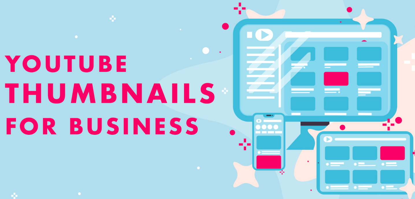
In today’s digital world, visual content drives attention. Whether someone is scrolling through YouTube, browsing social media, or searching for business advice online, the thumbnail is often the first thing they notice. For business channels, a strong thumbnail can mean the difference between a video that gets ignored and one that receives thousands of clicks.
Many creators focus heavily on video quality, scripts, and editing, but they often underestimate the power of thumbnails. A well-designed thumbnail acts like a mini billboard for your video. It communicates value, sparks curiosity, and convinces viewers to click.
For business channels—whether about entrepreneurship, marketing, finance, startups, or online income—thumbnails play a critical role in building credibility and increasing engagement. When done correctly, they can boost click-through rate (CTR), grow your subscriber base, and increase overall channel authority.
This detailed guide explains how to create the best thumbnails for business channels, including design principles, psychology, layout strategies, and practical tips used by successful creators.
Why Thumbnails Matter for Business Channels
Most platforms show viewers dozens of videos at once. Your thumbnail must compete with other creators to earn a click.
Here’s why thumbnails are so important:
1. Higher Click-Through Rate (CTR)
A strong thumbnail can significantly increase CTR. If two videos have the same topic but one has a more attractive thumbnail, it will likely receive more clicks.
2. Instant Topic Communication
A viewer should understand your video’s value in less than 2 seconds.
Good thumbnails quickly communicate things like:
-
Business growth strategies
-
Marketing secrets
-
Passive income tips
-
Startup lessons
-
Financial advice
3. Brand Recognition
Consistent thumbnails help build your channel identity. Over time, viewers begin recognizing your style immediately.
4. Professional Authority
Business content relies heavily on trust. Clean and professional thumbnails signal expertise and reliability.
What Makes a Great Business Thumbnail
A high-performing thumbnail combines clarity, emotion, and curiosity.
Here are the key ingredients.
Clear Subject Focus
Your thumbnail should have one main focal point.
Examples:
-
A confident entrepreneur pointing to rising profits
-
A laptop screen showing analytics growth
-
A shocked reaction next to revenue numbers
Too many elements confuse viewers.
Bold, Readable Text
Text helps highlight the main promise of your video.
Good thumbnail text usually:
-
Uses 3–5 words
-
Uses large bold fonts
-
Contrasts strongly with the background
Examples:
-
“$0 to $10K”
-
“Marketing Secret”
-
“Sales Trick”
-
“Startup Mistake”
Strong Emotions
Human faces with emotions increase engagement.
Common emotions used in business thumbnails:
-
Surprise
-
Excitement
-
Curiosity
-
Confidence
-
Shock
People naturally react to facial expressions.
High Contrast Colors
Bright and contrasting colors help thumbnails stand out in crowded feeds.
Popular combinations include:
-
Yellow + Black
-
Red + White
-
Blue + Orange
-
Green + Dark Gray
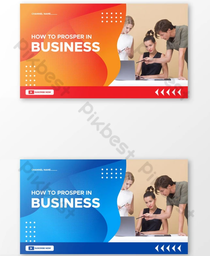
Thumbnail Design Styles That Work Best for Business Channels
Different styles appeal to different audiences. Here are some of the most effective ones.
The “Before vs After” Style
This works great for growth-focused content.
Example layout:
| Left Side | Right Side |
|---|---|
| Struggling Business | Successful Business |
| $0 Revenue | $10,000 Revenue |
| Sad Expression | Happy Expression |
This instantly communicates transformation.
The “Big Number” Thumbnail
Numbers attract attention and suggest clear results.
Examples:
-
$1,000/Day
-
10X Sales
-
100 Clients
-
3 Simple Steps
Numbers make business advice feel practical and measurable.
The “Curiosity Gap” Style
This design creates a question in the viewer’s mind.
Example elements:
-
Blurred screenshot
-
Hidden income report
-
Arrow pointing to a mystery object
Text examples:
-
“Nobody Talks About This”
-
“This Changed My Business”
-
“Hidden Strategy”
Curiosity leads to clicks.
The “Expert Authority” Look
For educational business channels, a professional appearance builds trust.
Typical features include:
-
Clean background
-
Confident pose
-
Minimal text
-
Subtle branding
This works well for topics like:
-
Finance
-
Investment
-
Consulting
-
Entrepreneurship education
Ideal Thumbnail Layout for Business Videos
Below is a simple layout that works consistently.
| Area | Content |
|---|---|
| Left Side | Face or main subject |
| Right Side | Text or numbers |
| Background | Simple, contrasting color |
| Additional Elements | Arrows, icons, charts |
This structure keeps the design clean and balanced.
Colors That Work Best for Business Thumbnails
Color psychology plays an important role in attracting viewers.
| Color | Meaning in Business Content |
|---|---|
| Blue | Trust, professionalism |
| Green | Growth, profit |
| Red | Urgency, excitement |
| Yellow | Attention, optimism |
| Black | Authority, sophistication |
Most successful channels use 2–3 main colors consistently.
Best Fonts for Business Thumbnails
Fonts must be bold and easy to read on small screens.
Popular font styles include:
-
Bold Sans Serif
-
Impact-style fonts
-
Heavy geometric fonts
Good font characteristics:
-
Thick letters
-
Strong outlines
-
High contrast
Avoid thin or decorative fonts because they become unreadable on mobile devices.
Common Thumbnail Mistakes Business Creators Make
Even experienced creators sometimes make mistakes that reduce clicks.
Too Much Text
If viewers must read a sentence, they will skip your video.
Bad example:
“Learn How to Start a Successful Online Business in 2026”
Good example:
“Online Business”
Overcrowded Designs
Too many icons, arrows, and objects make the thumbnail confusing.
A simple rule:
One subject + one message
Low Quality Images
Blurry images immediately reduce credibility.
Business channels must look professional and sharp.
Misleading Thumbnails
Clickbait thumbnails may get clicks initially, but they damage trust.
Viewers will stop watching if the video does not deliver the promised value.
Thumbnail Psychology That Drives More Clicks
Human psychology plays a big role in why people click.
Here are powerful triggers used by successful creators.
Curiosity
People click when they feel something is missing from the story.
Example text:
-
“This Strategy Works”
-
“Why This Failed”
Fear of Missing Out (FOMO)
FOMO motivates viewers to click quickly.
Examples:
-
“You’re Doing This Wrong”
-
“Stop Making This Mistake”
Desire for Success
Business audiences want growth.
Examples:
-
“10X Your Revenue”
-
“Build Passive Income”
Social Proof
People trust proven results.
Examples:
-
“1 Million Subscribers”
-
“$100K Business”
Tools to Create Professional Thumbnails
You don’t need advanced design skills to create great thumbnails.
Here are some popular tools.
Easy Design Platforms
-
Canva
-
Adobe Express
-
Snappa
These tools offer ready-made thumbnail templates.
Advanced Design Software
-
Photoshop
-
Affinity Designer
-
Figma
These give more control over effects and layout.
Screenshot & Graphic Tools
Helpful for business channels showing dashboards:
-
Screen capture tools
-
Chart creators
-
Analytics screenshots
Thumbnail A/B Testing Strategy
Many creators underestimate testing.
You can increase views significantly by testing different thumbnails.
Example experiment:
| Version | Style |
|---|---|
| Thumbnail A | Face + Text |
| Thumbnail B | Graph + Number |
| Thumbnail C | Curiosity Style |
After a few days, analyze which version performs best.
Thumbnail Design Workflow (Step-by-Step)
Here’s a simple process used by many successful creators.
Step 1: Identify the Video’s Core Idea
Ask yourself:
“What is the main benefit for viewers?”
Step 2: Turn the Idea into a Visual
Example:
Topic: Increase Sales
Visual: Upward arrow + excited face
Step 3: Write 3–5 Word Text
Example:
“Double Your Sales”
Step 4: Choose Colors
Use bold colors that contrast with your background.
Step 5: Add Small Design Elements
Possible elements:
-
Arrows
-
Circles
-
Highlights
-
Money icons
-
Graphs
Sample Thumbnail Concepts for Business Videos
Below are creative ideas you can use immediately.
| Video Topic | Thumbnail Text | Visual Idea |
|---|---|---|
| Passive Income | $500/Day | Laptop + money icons |
| Marketing Tips | Viral Strategy | Social media graph |
| Startup Advice | Don’t Do This | Shocked face |
| Freelancing | First Client | Message notification |
| Online Store | $0 to $10K | Revenue graph |
Infographic: Anatomy of a High-Performing Business Thumbnail
Key elements:
-
Clear focal point
-
Minimal text
-
High contrast
-
Emotional expression
Thumbnail Trends in Business Content
Thumbnail styles evolve over time. Here are some trends currently working well.
Minimalist Design
Simple backgrounds with bold text.
Bold Outlines
Creators outline themselves to separate from the background.
Graph-Based Thumbnails
Business audiences respond well to charts and growth visuals.
Reaction Faces
Human expressions increase relatability.
How Top Business Channels Design Their Thumbnails
Successful creators follow similar principles.
Common patterns include:
-
Large numbers
-
Clear promises
-
Emotional reactions
-
Clean design
-
Consistent branding
They also maintain similar color schemes across videos.
Mobile Optimization for Thumbnails
Over 70% of viewers watch on mobile devices.
Your thumbnail must look clear on small screens.
Checklist:
-
Text readable at small sizes
-
Strong contrast
-
No tiny details
-
Large subject focus
Thumbnail Branding Strategy
Consistent branding builds a strong identity.
Elements you can standardize:
-
Color palette
-
Font style
-
Text position
-
Logo placement
-
Editing style
When viewers recognize your style, they are more likely to click.
Measuring Thumbnail Performance
Track these metrics to evaluate effectiveness.
| Metric | What It Means |
|---|---|
| CTR | Percentage of people who clicked |
| Impressions | How many times it appeared |
| Watch Time | How long viewers stayed |
| Engagement | Likes and comments |
If CTR is low, the thumbnail likely needs improvement.
Final Thoughts: Turning Thumbnails into Click Magnets
In the crowded world of online business content, your thumbnail is your first sales pitch. Even the most valuable video can go unnoticed if the thumbnail fails to capture attention.
The best thumbnails for business channels are:
-
Simple
-
Clear
-
Emotionally engaging
-
Visually bold
-
Consistent with branding
By combining smart design, psychological triggers, and strong messaging, you can dramatically improve your video performance.
Remember, thumbnails are not just decoration—they are a strategic marketing tool. When designed correctly, they attract viewers, communicate value instantly, and help your business channel grow faster.
Start experimenting with different styles, analyze the results, and refine your approach. Over time, you’ll develop a thumbnail strategy that consistently brings more clicks, more views, and more loyal subscribers.
