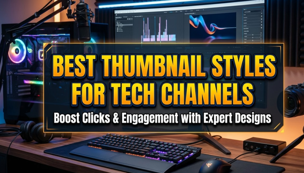
Before anyone watches your video, they see your thumbnail. That tiny image is the first thing people notice when they scroll through YouTube. And for tech channels especially, the best thumbnail styles for tech channels can be the difference between 500 views and 500,000 views.
Think about it this way. You could make the most detailed, well-researched tech video on the internet. But if the thumbnail looks boring or confusing, people will scroll right past it. YouTube's own data shows that thumbnails influence more than 90% of a viewer's decision to click on a video.
This guide breaks down exactly which thumbnail styles work best for tech channels. Whether you review gadgets, explain software, or teach coding tutorials, there's a style here that fits your content. Let's get into it.
What Makes a Great Tech Thumbnail
A great tech thumbnail does three things fast. It grabs attention, tells a story in one second, and makes the viewer curious enough to click.
Tech audiences are smart. They respond well to clean visuals, clear information, and honest presentation. Clickbait thumbnails that look misleading tend to hurt tech channels more than help them, because viewers in this niche are quick to notice when a video doesn't match its thumbnail.
Here's what strong tech thumbnails have in common:
- High contrast — Dark backgrounds with bright text or glowing product shots
- One clear focal point — One main subject, not a cluttered mess
- Readable text — Large, bold font that works even on a phone screen
- Emotional hook — Curiosity, excitement, or a before/after comparison
Now let's look at the actual styles you can use.
The 7 Best Thumbnail Styles for Tech Channels
1. Bold Text + Face Combo
This is the most popular thumbnail style on YouTube right now, and it works incredibly well for tech channels.
The layout is simple. A high-quality photo of a person (usually the creator) on one side, with large bold text on the other side. The person's expression matches the video's emotional tone — surprised, excited, confused, or impressed.
Why it works: Humans are wired to notice faces. When you combine a face with punchy text, the thumbnail delivers two types of information at once — emotional context and topic clarity.
Best for: Reviews, opinions, unboxings, and any video where the creator's reaction is part of the story.
Pro tip: Make sure the person in the thumbnail is looking toward the text or toward the center of the image. Eye direction pulls the viewer's attention naturally.
2. Product Close-Up Shot
For tech review channels, this style is a must-have in your toolkit.
The product takes up most of the frame — shot from an interesting angle with clean studio lighting or a dark gradient background. No clutter. Just the device, sharp and well-lit, with maybe a small text label showing the product name or a price/rating.
Why it works: People searching for tech reviews already want to see the product. Showing it clearly and cleanly communicates professionalism and trustworthiness. It also helps viewers find your video when browsing product-specific searches.
Best for: Smartphone reviews, laptop comparisons, accessory reviews, and unboxing videos.
Pro tip: Use a slightly tilted angle (around 15–20 degrees) to add dimension. A perfectly straight shot can look flat and forgettable.
3. Curiosity Gap Thumbnail
The curiosity gap style is all about creating a question in the viewer's mind that only the video can answer.
These thumbnails show you something unexpected, incomplete, or surprising. Maybe it's a blurred number, a censored part of a screen, or a weird error message. The viewer's brain immediately wants to fill in the blank.
Why it works: Humans have a natural urge to complete incomplete information. When a thumbnail gives you 80% of the answer and hides the other 20%, clicking feels almost automatic.
Best for: "I tested this for 30 days" videos, exposé-style content, mystery benchmarks, and hidden settings guides.
Pro tip: Keep it honest. If your thumbnail teases something that isn't in the video, viewers will leave early, which kills your watch time and hurts your algorithm ranking.
4. Before/After Split Thumbnail
This is one of the most effective thumbnail formats for tech upgrade and comparison videos.
The thumbnail is divided into two halves. The left side shows the "before" — old, slow, outdated, or broken. The right side shows the "after" — new, fast, upgraded, or fixed. A bold dividing line separates the two.
Why it works: The contrast is immediate and visual. You don't even need to read the text to understand what the video is about. This style also naturally implies a transformation, which is a powerful emotional hook.
Best for: Upgrade guides, phone comparisons, speed tests, software improvements, and PC build before/after content.
Pro tip: Use color to reinforce the contrast. A cooler, desaturated tone on the "before" side and a warmer, vibrant tone on the "after" side adds another layer of visual storytelling.
5. Minimal/Clean Thumbnail
This style goes against the grain, and that's exactly why it works.
Most tech thumbnails are loud, bright, and packed with elements. A minimal thumbnail — clean white or solid-color background, one product or icon, simple typography — stands out by doing less.
Why it works: In a sea of chaos, calm draws the eye. A minimal thumbnail also signals authority. Viewers associate clean design with professionalism, which builds trust before they even click.
Best for: Tutorial channels, developer content, SaaS reviews, productivity tools, and channels targeting a professional or business audience.
Pro tip: Use one accent color to give the thumbnail personality without making it busy. Think Apple's product marketing, but for YouTube.
6. Reaction/Emotion Thumbnail
Sometimes the most powerful thing in a thumbnail isn't the product — it's the person reacting to it.
Emotion thumbnails feature a close-up of the creator's face with a very specific, exaggerated expression. Shock, disbelief, joy, or confusion. No product needed. The face tells the whole story.
Why it works: We read faces faster than we read text. A strong expression instantly communicates the video's tone and emotional stakes. This style also builds a personal brand because viewers start recognizing the creator's face over time.
Best for: "I Can't Believe This Exists" videos, surprise reveals, shocking specs announcements, and personality-driven channels.
Pro tip: The expression needs to be genuine and specific. A generic smile doesn't drive clicks. Aim for an expression that says something — mouth open, eyes wide, or a raised eyebrow combined with a smirk.
7. Screenshot + Arrow/Annotation Thumbnail
This is the go-to style for how-to and tutorial tech channels.
The thumbnail shows a screenshot of a program, app, or setting — with a bright arrow, circle, or highlight pointing to the key thing viewers need to find. It looks like someone already started helping you before you even clicked.
Why it works: It immediately communicates that the video has a specific, practical answer. People searching for "how to fix X" or "how to find Y" click this style because it visually promises a step-by-step solution.
Best for: Tutorial channels, coding guides, Windows/Mac tips, app walkthroughs, and troubleshooting videos.
Pro tip: Use a bright red or yellow arrow against a darker screenshot background. Make the annotation obvious enough to see on a small mobile screen.
How to Choose the Right Thumbnail Style for Your Tech Channel
Not all seven styles work equally well for every type of tech channel. Here's a quick guide to help you match the right style to your content.
| Channel Type | Best Thumbnail Style(s) | Why It Works |
|---|---|---|
| Gadget & Phone Reviews | Product Close-Up + Bold Text | Shows the product clearly; builds trust |
| Tutorial / How-To | Screenshot + Arrow | Visually promises a solution |
| Tech News & Opinion | Bold Text + Face | Creator presence drives personality |
| Comparison Videos | Before/After Split | Instant visual contrast |
| Developer / Coding | Minimal/Clean | Matches the audience's aesthetic preference |
| Unboxings & Reveals | Reaction/Emotion | Emotional excitement drives clicks |
| Mystery / Exposé | Curiosity Gap | Creates suspense and drives curiosity |
Tech Thumbnail Design: Colors, Fonts, and Contrast That Work
Choosing the right style is just the beginning. The design details inside that style matter just as much.
Colors That Pop on YouTube
Tech channels tend to do very well with these color combinations:
- Dark background + neon/electric accent (common in gaming and PC build channels)
- White background + bold dark text (clean and editorial)
- Black + electric blue or green (classic tech aesthetic)
- Gradient dark backgrounds (great for product photography)
Avoid muddy, low-contrast combinations. Your thumbnail will appear as small as 68×38 pixels on some devices, so high contrast isn't just a preference — it's a necessity.
Fonts That Read Fast
Your thumbnail text should be readable in under one second. That means:
- Thick, heavy fonts over thin serif fonts
- All caps or title case for short phrases (never long sentences)
- Maximum two font sizes — one headline, one supporting detail
- Contrasting text color — white text on dark backgrounds, dark text on light backgrounds
Popular font choices for tech thumbnails include Bebas Neue, Montserrat Bold, Impact, and Anton. You can use any of these for free on Canva, which is one of the most popular tools for creating YouTube thumbnails quickly.
Text Placement Rules
- Keep text out of the bottom-left corner (YouTube's watch time indicator covers it)
- Don't put important elements near the edges (cropping risk on different devices)
- Use a subtle text shadow or glow if your text sits on a complex background
Tools to Design Tech Channel Thumbnails
You don't need expensive software to make professional-looking thumbnails. Here are the most commonly used tools:
Canvix — A powerful tool built for YouTube creators who want to design standout thumbnails quickly. Great for beginners and advanced creators alike.
Canva — Beginner-friendly with a huge library of templates. Excellent for the clean and minimal thumbnail style.
Adobe Photoshop — The industry standard for photo editing. Best for creators who want full control over every pixel.
Adobe Express — A simpler version of Photoshop. Good middle ground between Canva and full Photoshop.
GIMP — Free and open-source. A solid choice for creators on a budget who still want advanced editing features.
Snapseed (mobile) — Surprisingly powerful for editing thumbnail photos directly on your phone.
Common Thumbnail Mistakes Tech Creators Make
Even creators who understand the best thumbnail styles for tech channels still fall into these traps.
Too Much Text
Three words beat ten words every time. If your thumbnail needs a sentence to explain itself, the design isn't working hard enough. Cut it down.
Low-Resolution Images
Blurry thumbnails look unprofessional and signal low-quality content. Always design at 1280×720 pixels minimum. Export at the highest quality your tool allows.
Inconsistent Style
Viewers who like your channel should be able to recognize your thumbnails in a crowded feed. If every video looks completely different, you're not building a visual brand. Pick two or three styles that fit your channel and rotate between them.
Misleading Thumbnails
Clickbait might get the click, but it destroys your watch time. When viewers feel tricked, they leave fast. And YouTube's algorithm punishes low watch time heavily. Honest, intriguing thumbnails always outperform deceptive ones in the long run.
Ignoring Mobile Viewers
More than 70% of YouTube views happen on mobile. That means your thumbnail needs to communicate its message on a tiny screen. Test every thumbnail by shrinking it to see if it still works at small sizes.
How Top Tech Channels Use Thumbnails Differently
Some of the biggest tech channels on YouTube have built their entire visual identity around a signature thumbnail style.
Channels that review flagship smartphones tend to lean heavily into the product close-up format — sharp images, dark backgrounds, and minimal text. It communicates that the channel is a serious resource for product research.
Personality-driven channels mix the bold text + face format with consistent color schemes and recurring visual elements. Viewers can spot their thumbnails instantly across the homepage.
Tutorial-focused channels almost always use the screenshot + annotation style. It builds viewer trust because the thumbnail looks like the content will be practical and specific.
What all these channels have in common is consistency. They pick their style, they refine it, and they stick to it long enough for viewers to start recognizing their thumbnails automatically.
Building a Thumbnail Brand for Your Tech Channel
Once you understand the best thumbnail styles for tech channels, the next step is turning that knowledge into a signature visual brand.
Here's how to build one:
Step 1: Pick a color palette. Choose two to three colors that will appear in most of your thumbnails. These become your brand colors.
Step 2: Choose one or two primary styles. Don't try to use all seven styles at once. Pick the ones that match your content type and stick to them.
Step 3: Use consistent typography. Same font, same font size rules, same text placement across every thumbnail.
Step 4: Create a template. Most thumbnail tools let you save templates. Create a base layout you can update for each video in minutes.
Step 5: Review and refine. Check your YouTube Analytics click-through rate (CTR) for each video. The videos with the highest CTR usually have the strongest thumbnails. Study those and apply what's working to future designs.
A CTR above 6% on YouTube is generally considered good. Many top tech channels consistently hit 8–12% CTR by combining a recognizable style with strong thumbnail execution.
FAQs About Tech Channel Thumbnails
Q: What is the ideal thumbnail size for YouTube?
The ideal thumbnail size is 1280×720 pixels with a 16:9 aspect ratio. Keep the file size under 2MB and export as JPG or PNG.
Q: How many words should a thumbnail have?
Aim for three to six words maximum. Shorter is usually better. The visual should carry most of the message, with text reinforcing it.
Q: Should tech creators always show their face in thumbnails?
No, not always. Face thumbnails work well for personality-driven channels. Product channels and tutorial channels can perform just as well without a face in the thumbnail. Test both styles and see which performs better for your specific audience.
Q: How often should I update my thumbnail style?
If your CTR drops consistently below 3–4% for several videos in a row, it might be time to test a fresh approach. However, avoid changing your entire style too frequently, as consistency is key to building recognition.
Q: Does thumbnail style affect SEO?
Thumbnail style affects click-through rate (CTR), and CTR is one of the signals YouTube uses to determine how widely to distribute your video. So while the thumbnail itself doesn't directly affect search ranking, a better thumbnail leads to more clicks, which helps the algorithm push your video further. In that way, yes — good thumbnail design is part of your YouTube SEO strategy.
Q: Can I use AI to generate tech thumbnails?
Yes, several AI tools can help generate or enhance thumbnail images. However, most top creators still use manual tools like Photoshop or Canva for final thumbnail design because they offer more precise control over text, layout, and branding.
Q: What background color works best for tech thumbnails?
Dark backgrounds (black, deep navy, or dark gray) tend to perform very well for tech channels because they make product images and text pop. That said, clean white backgrounds work excellently for minimal/editorial styles targeting professional audiences.
Final Thoughts: Start Testing and Keep Improving
There's no single perfect thumbnail formula that works for every tech channel. But the seven styles covered in this guide — bold text + face, product close-up, curiosity gap, before/after split, minimal/clean, reaction/emotion, and screenshot + annotation — give you a solid foundation to build from.
The best thumbnail styles for tech channels are the ones your specific audience clicks on. And the only way to find that out is to start testing, track your CTR in YouTube Analytics, and keep improving your designs based on real data.
Pick one or two styles that fit your content. Build a consistent template. Then commit to it long enough to see results.
Your thumbnail is a promise to your viewer. Make it a promise worth clicking.
