Vlogging has become one of the most powerful ways to share stories, build an audience, and grow a brand online. However, creating great videos is only half the battle. If people don’t click on your video, they will never see your content.
This is where thumbnails play a crucial role.
A thumbnail is the first visual impression viewers get before watching your vlog. It acts like a mini movie poster for your video. An attractive thumbnail can dramatically increase your click-through rate (CTR), while a boring one can cause people to scroll past your content.
Many successful vloggers spend almost as much time designing thumbnails as they do editing their videos because thumbnails influence whether viewers click or ignore your video.
In this complete guide, you will learn:
-
The best thumbnail styles for vlogs
-
Elements that make thumbnails clickable
-
Proven design techniques used by top vloggers
-
Common mistakes to avoid
-
Practical tips to boost video clicks
Let’s explore how to create thumbnails that grab attention instantly.
Why Vlog Thumbnails Matter More Than You Think
Before we dive into styles, it's important to understand why thumbnails matter so much.
Most viewers decide within 1–2 seconds whether to click a video. During this short moment, they judge:
-
The thumbnail
-
The title
-
The topic
If the thumbnail is boring, confusing, or low quality, viewers may skip the video—even if the content is excellent.
Key Benefits of a Good Thumbnail
A well-designed vlog thumbnail can:
-
Increase click-through rate (CTR)
-
Improve YouTube ranking
-
Attract new viewers
-
Boost watch time
-
Strengthen brand identity
Quick Comparison
| Thumbnail Quality | Viewer Reaction | Result |
|---|---|---|
| Bright, clear, emotional | Curious and interested | Higher clicks |
| Simple but professional | Trustworthy | Consistent growth |
| Dark, cluttered, blurry | Confused | Lower CTR |
| No custom thumbnail | Looks low effort | Ignored |
Core Elements of a High-Performing Vlog Thumbnail
Every successful vlog thumbnail usually includes several powerful visual elements.
1. A Clear Human Face
Faces attract attention naturally. People connect with emotions.
Common expressions used in vlog thumbnails include:
-
Surprise
-
Happiness
-
Shock
-
Curiosity
-
Fear
-
Excitement
Tip: Make sure the face is large and easy to see even on mobile devices.
2. Bold and Minimal Text
Text helps viewers understand what the video is about instantly.
Best practices:
-
Use 2–5 words maximum
-
Use large bold fonts
-
Use high contrast colors
Example text styles:
-
"I Tried This!"
-
"24 Hours Challenge"
-
"My First Vlog"
-
"You Won't Believe This"
Too much text makes thumbnails cluttered and hard to read.
3. High Contrast Colors
Bright colors stand out on crowded platforms.
Best color combinations:
| Background | Text Color | Why It Works |
|---|---|---|
| Yellow | Black | Very readable |
| Red | White | Eye-catching |
| Blue | Yellow | Strong contrast |
| Black | Neon colors | Dramatic effect |
Successful vlog thumbnails often use saturated colors to pop out from the feed.
4. Simple Composition
Many beginners try to add too many elements:
-
Too many pictures
-
Too much text
-
Too many emojis
This makes the thumbnail confusing.
Instead, use one main subject.
Example structure:
Simple thumbnails often perform better.
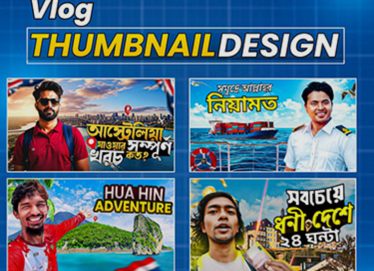
7 Best Thumbnail Styles for Vlogs
Different vlog niches benefit from different thumbnail styles. Below are the most effective ones used by successful creators.
1. The Reaction Face Style
This is one of the most popular vlog thumbnail styles.
It focuses on emotional reactions.
Why It Works
Humans are naturally curious about emotions. If someone looks shocked or excited, viewers want to know why.
Typical Layout
-
Large face
-
Strong emotion
-
Bright background
-
Minimal text
Example Scenario
A travel vlog thumbnail might show:
-
The vlogger looking shocked
-
A huge waterfall in the background
-
Text: "This Place Is Unreal!"
2. The Story Moment Style
This style captures a key moment from the vlog.
Instead of posing, the thumbnail shows a real event from the video.
Examples:
-
Falling into water
-
Eating unusual food
-
Getting surprised
Benefits
-
Feels authentic
-
Builds curiosity
-
Shows real action
Example
Text:
"Worst Day Ever"
Image:
Vlogger stuck in rain during travel.
3. Before and After Style
This style shows transformation.
Viewers love seeing change.
Examples include:
-
Room makeover
-
Weight loss journey
-
Travel destination before vs after
-
Glow-up
Layout
Split screen:
| Left | Right |
|---|---|
| Before | After |
Add arrows or contrast colors to highlight the change.
4. Curiosity Gap Style
This type of thumbnail creates mystery.
The viewer cannot fully understand the image, so they click to find out.
Examples:
-
Blurred object
-
Covered item
-
Strange situation
Text examples:
-
"What Is This?"
-
"I Regret This..."
-
"This Was a Bad Idea"
Curiosity is one of the strongest click triggers.
5. Minimalist Clean Style
Some vloggers prefer a simple design.
These thumbnails usually include:
-
One image
-
One short text
-
Plain background
Why It Works
Minimalist thumbnails feel clean and professional.
They also stand out among busy thumbnails.
6. Object Highlight Style
This style focuses on a specific object.
For example:
-
Expensive gadget
-
Strange food
-
Mystery package
-
Unique location
Often used in daily life or lifestyle vlogs.
Design elements include:
-
Zoomed-in object
-
Circle or arrow pointing at it
-
Surprised reaction
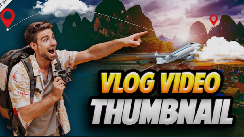
7. Cinematic Travel Style
Travel vloggers often use cinematic thumbnails.
These focus more on beauty than facial expressions.
Characteristics:
-
Landscape photography
-
Natural lighting
-
Color grading
-
Dramatic scenery
Example:
A person standing on a mountain cliff.
Text:
"Hidden Paradise"
Thumbnail Design Formula Used by Successful Vloggers
Many viral vlog thumbnails follow a simple formula.
The 4-Part Formula
Example:
Emotion: shocked face
Curiosity: strange object
Color: bright yellow background
Message: "I Tried This!"
This combination increases the chance of getting clicks.
Thumbnail Size and Technical Requirements
To ensure thumbnails look sharp on all devices, use proper settings.
| Feature | Recommended Value |
|---|---|
| Resolution | 1280 × 720 pixels |
| Aspect Ratio | 16:9 |
| File Size | Under 2MB |
| Format | JPG or PNG |
Make sure the image is clear even on small mobile screens.
Thumbnail Layout Example
Below is a simple visual layout used by many vloggers.
This layout keeps things simple and effective.
Tools to Create Professional Vlog Thumbnails
You don't need expensive software to design great thumbnails.
Here are some popular tools.
| Tool | Best For |
|---|---|
| Canva | Beginners |
| Photoshop | Professional editing |
| Figma | Design flexibility |
| Pixlr | Quick online editing |
| Snappa | Fast thumbnail creation |
Most vloggers start with Canva because it is simple and fast.
Common Thumbnail Mistakes to Avoid
Even good vloggers sometimes make mistakes that reduce clicks.
Here are some common problems.
1. Too Much Text
If viewers must read a paragraph, they will skip the video.
Keep text short and bold.
2. Low Quality Images
Blurry or pixelated thumbnails look unprofessional.
Always export in high resolution.
3. Misleading Thumbnails
Clickbait may get clicks but can hurt your channel if the content doesn’t match.
This reduces audience trust and watch time.
4. Dark or Dull Colors
Dark thumbnails blend into the background.
Bright thumbnails attract more attention.
5. Small Faces
If the face is tiny, viewers cannot see the emotion.
Zoom in.
Thumbnail Psychology: Why People Click
Successful thumbnails use psychological triggers.
Here are the most effective ones.
Curiosity
People want answers.
Example text:
-
"I Shouldn't Have Done This"
-
"This Changed Everything"
Emotion
Emotion drives engagement.
Examples:
-
Shock
-
Happiness
-
Fear
-
Surprise
Contrast
High contrast colors catch attention faster than neutral tones.
Relatability
If viewers feel connected to the situation, they click.
Example:
"My First Day Alone"
Thumbnail Optimization Tips for Vlog Growth
Use these strategies to improve performance.
1. Test Different Styles
Some creators test multiple thumbnails to see which performs best.
2. Study Popular Vloggers
Look at trending vlog thumbnails and analyze:
-
Colors
-
Facial expressions
-
Text style
-
Layout
3. Keep Branding Consistent
Using similar colors or fonts helps viewers recognize your videos quickly.
4. Use Visual Hierarchy
Guide the viewer's eye.
Example order:
-
Face
-
Object
-
Text
Example Thumbnail Strategy for a New Vlogger
If you are starting a vlog channel, follow this simple approach.
Step-by-Step
-
Capture a strong reaction photo
-
Choose a bright background
-
Add 2–3 word text
-
Highlight the main object
-
Keep design simple
This method works for many vlog niches.
Future Trends in Vlog Thumbnails
Thumbnail design continues to evolve.
Here are upcoming trends:
-
AI-assisted design tools
-
Animated thumbnails
-
3D effects
-
More cinematic photography
-
Cleaner minimalist styles
However, the core rule will remain the same:
Make viewers curious enough to click.
Final Thoughts: The Secret to the Best Vlog Thumbnails
Creating the best thumbnail style for vlogs is not about complicated design. It is about capturing attention quickly and clearly.
The most effective vlog thumbnails usually include:
-
Strong emotional expressions
-
Bright, contrasting colors
-
Short, bold text
-
A clear visual story
Remember that your thumbnail is the gateway to your video. Even the best vlog content needs a powerful thumbnail to attract viewers.
If you consistently apply the strategies discussed in this guide, your thumbnails will become more engaging, your videos will get more clicks, and your vlog channel will have a much better chance of growing.
Take time to experiment with different styles, analyze what works for your audience, and keep improving your designs. Over time, you will develop a thumbnail style that becomes part of your personal brand—and that can make all the difference in the competitive world of vlogging.
