Your thumbnail layout is the first thing people see — before your title, before your description, before anything else. It is your silent salesperson. And in a world where thousands of videos, articles, and posts compete for attention every single second, a weak thumbnail is like a closed door.
Studies show that viewers decide whether to click on content in less than two seconds. That means your thumbnail has to do a lot of heavy lifting in very little time. The right layout can mean the difference between 2% click-through rates and 12% — and that gap adds up to thousands of extra viewers.
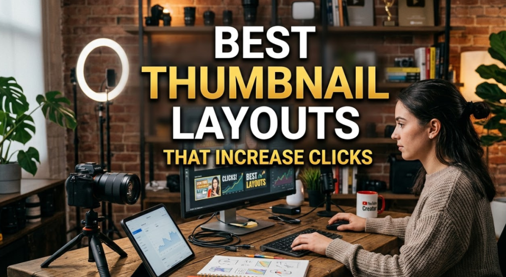
This guide breaks down the best thumbnail layouts that increase clicks. Whether you create YouTube videos, blog posts, online courses, or social media content, these layouts are proven to work. You will learn why each one works, how to use it, and how to avoid common mistakes that kill your click-through rate (CTR).
Let us get into it.
What Makes a Thumbnail Layout Actually Work
Before you can pick the right layout, you need to understand what drives a person to click. It comes down to three psychological triggers:
Curiosity — The thumbnail makes them wonder about something. They need to click to find out.
Emotion — The thumbnail makes them feel something. Excitement, shock, humor, or inspiration.
Recognition — The thumbnail clearly signals what the content is about. They know exactly what they are getting.
The best thumbnail layouts tap into at least one of these triggers. The great ones hit all three at once.
There are also a few design basics that every good thumbnail needs:
- High contrast between the background and the main subject
- Large, bold text that is readable even at small sizes
- A clear focal point — your eye knows where to look first
- Minimal clutter — no more than three elements in one frame
Now let us look at the specific layouts that put all of this together.
The Top Thumbnail Layouts That Get More Clicks
1. The Face Close-Up Layout
This is one of the most powerful thumbnail layouts that increase clicks. And the reason is simple — humans are wired to look at faces.
When someone sees a face in a thumbnail, especially one showing a strong emotion, they stop scrolling. The face pulls them in. Add a wide-open mouth, raised eyebrows, or direct eye contact, and the effect gets even stronger.
How to use it:
- Fill at least 60–70% of the thumbnail with the face
- Use an expression that matches the emotion of the content — surprise, excitement, or concern
- Leave some space on the left or right for a short text label
- Make sure the lighting is sharp and the background is not distracting
Best for: Reaction videos, personal vlogs, opinion pieces, tutorials led by a host
Common mistake: Using a flat, expressionless headshot. This layout only works when the face is animated and expressive.
2. The Bold Text + Visual Split Layout
This layout divides the thumbnail into two clear zones: one side holds a strong visual (a photo, graphic, or product), and the other side holds bold, punchy text. Think of it as a mini billboard.
It works because both elements reinforce each other. The image creates context and emotion. The text delivers the hook or promise. Together, they answer the viewer's key question: What is this about and why should I care?
How to use it:
- Keep the split clean — usually 50/50 or 60/40
- Use a contrasting background behind the text so it pops
- Limit the text to 3–5 words maximum
- Use a font that is thick, easy to read at small sizes
Best for: How-to content, listicles, tutorials, product reviews, news commentary
Common mistake: Writing too much text. Long sentences lose the viewer instantly. Keep it brutally short.
3. The Before & After Layout
Few things grab attention faster than contrast. The before-and-after layout puts two states side by side — the problem on the left, the result on the right. Viewers instantly understand the story: something changed, and they can find out how.
This layout is especially powerful because it makes a visual promise. It shows proof of transformation. That promise makes people curious enough to click.
How to use it:
- Use a clear dividing line or slight color difference between the two halves
- Label each side with bold text: "BEFORE" and "AFTER"
- Make the contrast dramatic — the more visible the difference, the better
- Keep both sides clean and easy to read at a glance
Best for: Weight loss, home renovation, skin care, coding projects, design makeovers, productivity systems
Common mistake: Choosing two images that look too similar. The contrast must be obvious, even on a small screen.
4. The Number-Driven List Layout
Numbers are processed by the brain faster than words. When someone sees "7 Ways to…" or "10 Mistakes…" in a thumbnail, their brain immediately starts forming expectations. They know what to expect, and that clarity makes them more likely to click.
This thumbnail layout also taps into something called the list psychology — people feel like they are getting organized, useful information. Numbers signal value.
How to use it:
- Make the number the dominant element — go big, go bold
- Pair it with a short descriptor: "5 Tricks" or "3 Rules"
- Use a bright color for the number to make it pop off the background
- Keep the overall design simple so the number leads the eye
Best for: Listicles, tips videos, tutorials, advice content, ranking videos
Common mistake: Hiding the number in the title text instead of making it a design element. The number needs to be a visual anchor, not just a word.
5. The Curiosity Gap Layout
This layout is built on one idea: show just enough to make someone need to see more. The thumbnail teases a piece of information but deliberately leaves it incomplete. The viewer clicks to fill in the gap.
This is one of the most psychologically effective thumbnail layouts that increase clicks — but it requires a careful balance. Too vague, and people do not care. Too specific, and there is nothing left to discover.
How to use it:
- Use a phrase that implies something surprising or incomplete: "You Won't Believe…" or "This Changes Everything"
- Pair it with a visual that shows something unusual or out of context
- Use arrows, circles, or question marks to direct attention
- Make the viewer feel like they are missing out on something important
Best for: Shocking reveals, myth-busting content, secrets, tips that feel counterintuitive
Common mistake: Being so vague that the viewer has no reason to care. There needs to be an emotional hook attached to the mystery.
6. The Product Hero Layout
If you are reviewing, selling, or showcasing a product, this layout puts the product front and center. Clear, well-lit, and given space to breathe. This layout builds trust because it is straightforward. It says: this is what we are talking about, no tricks.
How to use it:
- Place the product in the center or slightly off-center for visual balance
- Use a clean, contrasting background
- Add a short headline on one side
- Include subtle elements like star ratings, arrows, or comparison tags if relevant
Best for: Product reviews, unboxing videos, tech content, affiliate marketing thumbnails
Common mistake: Over-cluttering the frame. The product needs room. Blank space is not wasted space — it is focus.
The Thumbnail Elements That Boost Every Layout
Even the best layout fails without the right details. Here are the four elements that make any thumbnail layout work harder.
Color Contrast Is Non-Negotiable
If your main subject blends into the background, you lose. High contrast is what pulls the eye. Red and white. Yellow and black. Dark and light.
Tools like Canvix make it easy to build high-contrast thumbnails quickly, even if you have zero design experience. You can pick contrast-tested color combos and pair them with professional layouts in minutes.
Typography That Reads at Tiny Sizes
Your thumbnail will often appear at the size of a postage stamp in someone's feed. Your text needs to be readable at that scale. Bold, sans-serif fonts with thick strokes work best. Avoid thin fonts, script fonts, or anything with too many decorative details.
Keep text to three to five words maximum. If you need more than that to explain your content, rethink the hook.
Faces and Expressions Drive Emotion
Even if your primary layout is not a face close-up, adding a face somewhere in the thumbnail adds warmth and emotional connection. An expression — especially a strong one — tells the viewer how to feel about the content before they even read the title.
Directional Cues Lead the Eye
Arrows, pointed fingers, and diagonal lines are powerful tools. They tell the viewer where to look. Use these cues to guide the eye from a face to a text label, or from a before image to an after image. Intentional eye flow keeps your design from feeling chaotic.
Thumbnail Layout Comparison Table
| Layout | Best For | Key Visual Element | CTR Strength |
|---|---|---|---|
| Face Close-Up | Vlogs, Reactions | Expressive face, 60%+ fill | Very High |
| Text + Visual Split | How-To, Tutorials | Bold text zone + image | High |
| Before & After | Transformations | Two-side contrast | Very High |
| Number-Driven List | Tips, Rankings | Large, bold number | High |
| Curiosity Gap | Reveals, Secrets | Incomplete visual hook | High |
| Product Hero | Reviews, Showcases | Clean product shot | Moderate–High |
How to Match Your Layout to Your Content Type
Not every layout works for every type of content. Choosing the wrong one is like wearing a suit to a beach party — technically fine, but clearly off.
Here is a simple way to match your layout to your content:
If your content is personal or story-driven — go with the face close-up layout. Your personality is the hook. Let it show.
If your content teaches something specific — go with the text + visual split or the number-driven layout. These formats signal clear, structured value.
If your content shows change or improvement — the before and after layout is your best friend. The visual contrast does the work before anyone reads a single word.
If your content is a review or showcase — the product hero layout builds immediate credibility. It shows you know what you are talking about.
If your content involves a surprising fact or counterintuitive idea — the curiosity gap layout is perfect. Use it to tease the reveal without giving it away.
Mistakes That Kill Your Thumbnail's Click Rate
Understanding what to do is only half the equation. Here is what you must avoid.
Too Much Text
Three to five words. That is your limit. The moment a thumbnail starts looking like a paragraph, it loses. People scroll fast. If your text takes more than half a second to read, it will be skipped.
Low Contrast
A thumbnail where everything blends together is invisible. Test your thumbnail by shrinking it down to the size of a phone screen. If you cannot instantly identify the main element, your contrast is too low.
Generic Stock Photos
Stock photos feel fake. Viewers can sense it. If you are using a photo, use a real one — of you, your product, or a genuine scene related to your content. Authenticity builds trust, and trust drives clicks.
No Clear Focal Point
Every good thumbnail leads the eye somewhere specific. If there are five competing elements and no visual hierarchy, viewers' eyes wander and they move on. Pick one main element and build everything else around it.
Ignoring Mobile Viewers
According to YouTube's internal data, over 70% of YouTube watch time comes from mobile devices. This means your thumbnail will almost always be seen on a small screen first. Design for mobile, and it will look great on desktop too.
A Step-by-Step Process for Designing a High-Click Thumbnail
Here is a simple workflow you can follow every time you make a thumbnail.
Step 1: Define the hook. What is the one thing about this content that would make someone stop scrolling? Write it in one sentence.
Step 2: Choose your layout. Based on your content type, pick the layout that matches best from the list above.
Step 3: Select your focal element. Is it a face? A product? A before-and-after? Place this element first.
Step 4: Add text. Maximum five words. Make it bold. Use a high-contrast color. Position it so it does not cover the focal element.
Step 5: Check contrast. Shrink the design to 50% size. Is everything still readable? Is the focal point still obvious?
Step 6: Get a second opinion. Show it to someone who has not seen your content. Ask them what they think the video is about. If they cannot answer in three seconds, go back to step one.
FAQs About Thumbnail Layouts That Increase Clicks
Q: How many elements should a thumbnail have?
Keep it to two or three elements maximum. A main visual (face, product, or scene), a short text hook, and possibly a supporting graphic like an arrow or logo. Any more than that and the design becomes cluttered and hard to read at small sizes.
Q: Does thumbnail size matter?
Yes. YouTube thumbnails are 1280 x 720 pixels at a 16:9 ratio. But because most people view them at small sizes, you should design as if the thumbnail will be displayed at 300 x 170 pixels. Everything needs to be visible and readable at that scale.
Q: Should I always include text in my thumbnail?
Not always, but usually yes. Text gives the viewer extra context and reinforces the promise of the content. However, if your image tells the whole story on its own — like a dramatic before-and-after — the text can take a back seat or even be left out entirely.
Q: Does thumbnail style vary by platform?
Yes. YouTube thumbnails tend to be more dramatic and expressive. LinkedIn thumbnails lean toward professional and clean. Instagram thumbnails favor aesthetic and visually consistent designs. Pinterest thumbnails do well with vertical orientation and lifestyle imagery. Always consider where your audience is viewing from.
Q: How often should I update my thumbnails?
Test new thumbnails on older content every three to six months. A fresh thumbnail can revive a post that has stopped getting traffic. Many creators have doubled their views simply by switching to a stronger thumbnail layout without changing anything else.
Q: What tools can I use to create thumbnails?
There are many good options. Canvix is a beginner-friendly tool with ready-made thumbnail templates built for high CTR. Adobe Photoshop is the professional standard. Canva is popular for its ease of use. Figma works well if you want more control over design precision.
Q: Can I use AI-generated images in thumbnails?
Yes, and many creators already do. AI images can fill the role of the visual element in your layout — as a background, a supporting graphic, or even a stylized face. Just make sure it aligns with your brand and feels authentic rather than generic.
Your Next Step Toward Better Click-Through Rates
The best thumbnail layouts that increase clicks are not about fancy design skills. They are about understanding your viewer's psychology and giving them a clear, compelling reason to click.
Start with one layout from this guide that matches your next piece of content. Apply the design principles — high contrast, minimal text, strong focal point, and emotional cue. Test it. Watch your CTR. Then refine.
Great thumbnails are built through iteration. The creators with the highest click-through rates are not more talented — they test more often, learn faster, and keep improving.
Your thumbnail is your first impression. Make it count.
